There’s a specific frustration that comes with receiving a 3D product render that’s technically complete but visually wrong. The geometry is accurate. The proportions match the spec sheet. But something about it looks immediately artificial — too plastic, too shiny, strangely weightless. You can’t always put your finger on exactly what’s broken, but your eye knows. Understanding why your 3D product renders look fake: 5 common lighting and material mistakes is genuinely useful knowledge — not just for artists, but for anyone briefing a studio, reviewing deliverables, or deciding whether to approve a render before it goes into production.
In our studio, we see this pattern constantly. A product developer or e-commerce brand comes to us with renders that were done in-house or by a cheaper vendor, and the complaint is almost always the same: “It doesn’t look real.” When we open the file and start working through it, the same five technical problems keep appearing. They’re not exotic failures. They’re fundamental habits that got skipped or misunderstood during production. And the good news is that every single one of them is fixable once you know what you’re looking at.
Mistake 1: Treating HDRI Lighting as a Set-and-Forget Solution
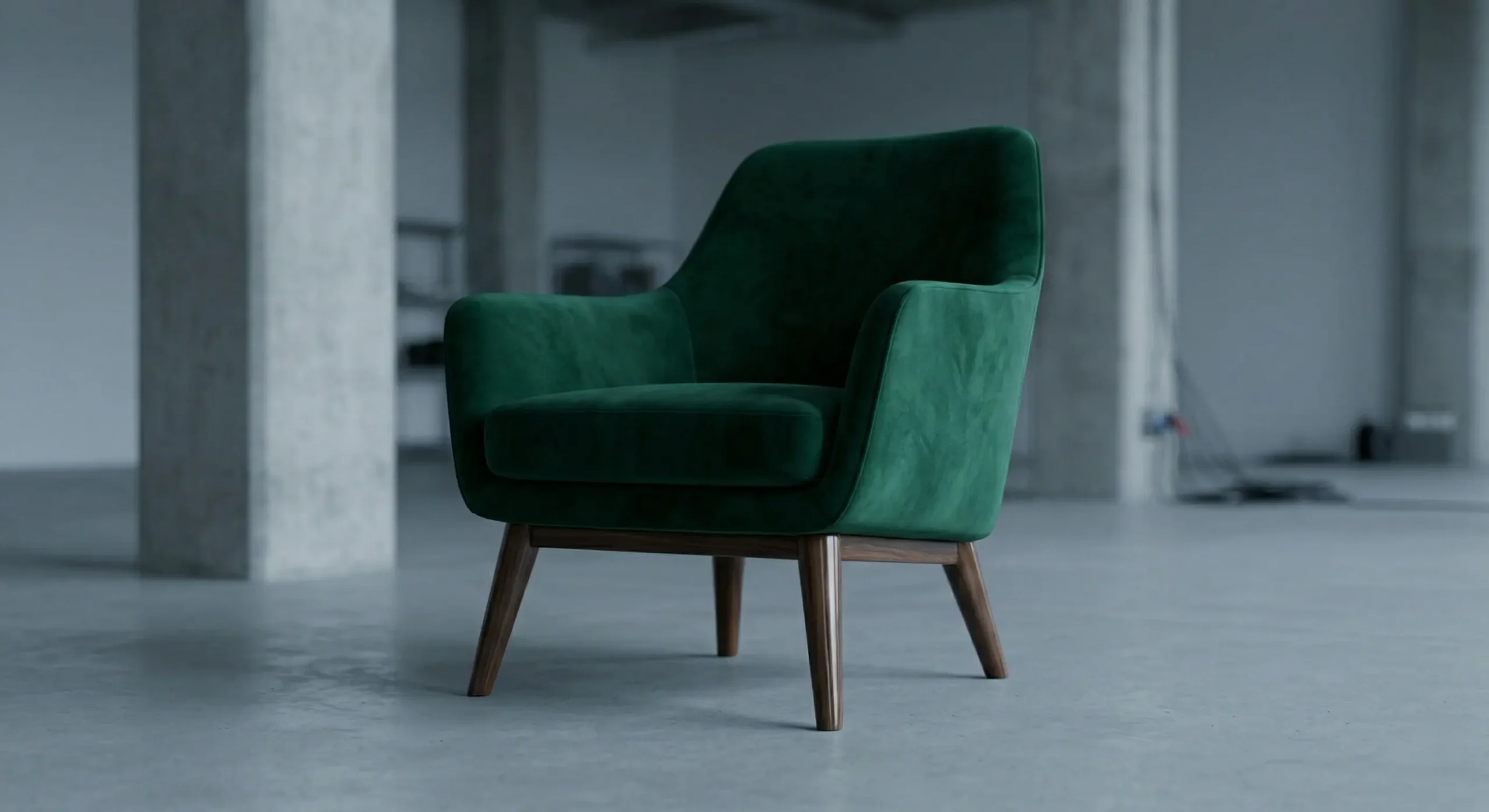
HDRI (High Dynamic Range Image) lighting is the industry standard for realistic ambient illumination. An HDRI is essentially a 360-degree photograph of a real environment — a studio, an overcast sky, a warehouse — wrapped around your scene so that light behaves the way it does in the real world. The problem isn’t using HDRIs. The problem is using them without any intention.
Most artists drop in an HDRI, accept whatever rotation it loaded at, and move on. That’s a mistake. The bright regions of the HDRI — the sun, a studio softbox, a window — are your actual key light sources. Their position in the rotation determines where shadows fall, where highlights appear, and what reflections show up on your product surface. For anything with a glossy or specular finish — a perfume bottle, a phone case, a cosmetic compact — those reflections define the perceived shape of the object. Position them carelessly and the product looks formless.
The correct approach is to rotate your HDRI deliberately until your primary light source aligns with your compositional intent. Then add a secondary area light on the shadow side to control fill ratio. HDRI gives you environmental plausibility; your supplementary lights give you control over how the product actually reads. Relying entirely on HDRI for commercial product work is one of the most common reasons renders look vague rather than polished.
Mistake 2: Physically Incorrect Material Values — The Core of Why 3D Product Renders Look Fake
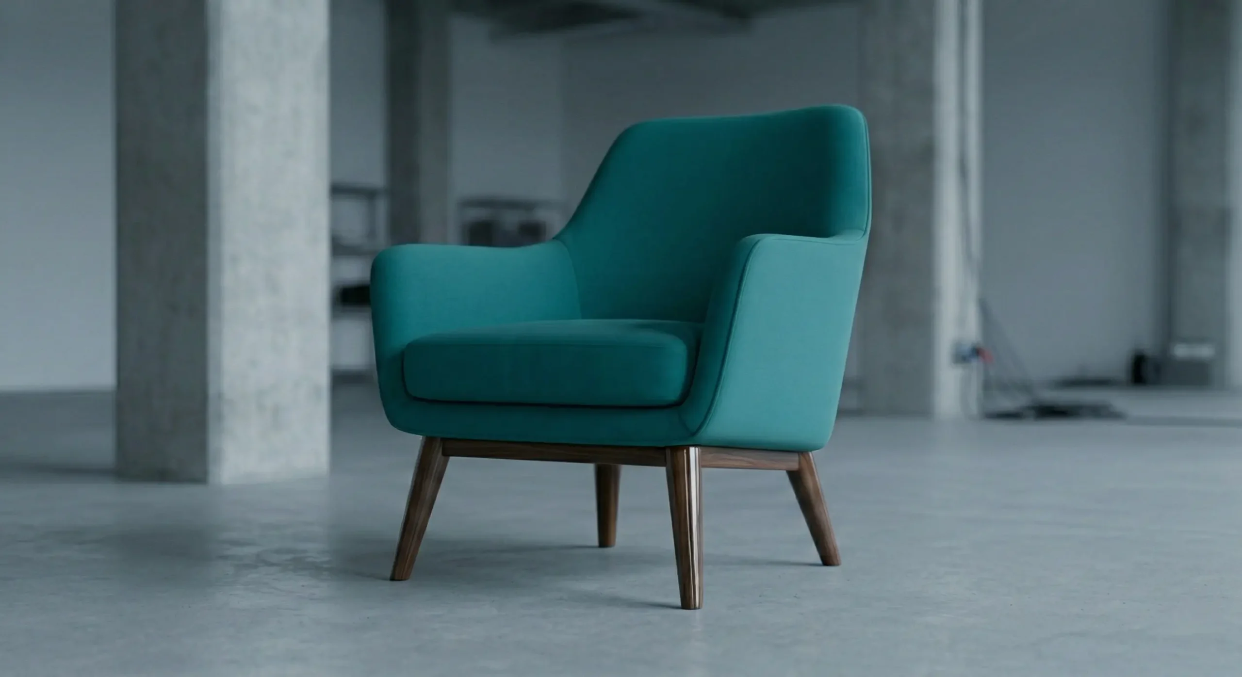
This is where most renders fall apart. Modern render engines use Physically Based Rendering (PBR), which means every material is defined by real-world optical properties: how rough the surface is, how much light it reflects at direct versus glancing angles, whether the surface is metallic or dielectric. When these values are set incorrectly — through guesswork rather than physical reference — the result is a material that your brain rejects without being able to say exactly why.
Here’s what we see regularly:
- Plastic that looks like rubber — roughness set too high, no defined specular highlight
- Metal that looks like chrome spray paint — reflectivity at maximum with no surface variation whatsoever
- Leather that looks like vinyl — missing the microstructure detail that normal maps provide, no subsurface response
- Glass that looks like water — IOR set wrong, no edge darkening, missing the way real glass compresses light at curved edges
- Wood that looks laminated — tiled texture with no gloss variation following the grain direction
In a proper PBR workflow, non-metallic (dielectric) surfaces have a defined base reflectivity at perpendicular viewing angles — it’s a physical constant, not an artistic preference. Metals derive their color from reflective values rather than from albedo. When an artist sets metallic values to something in the middle “to get a bit of both,” or cranks specular on plastic to make it look premium, they’re breaking physical plausibility and the render shows it immediately.
The fix: use real-world PBR material references. Manufacturer-supplied texture packs are ideal. If you’re building a material from scratch, photograph the actual object under controlled lighting and match what the camera sees. Don’t estimate. This is especially critical for categories like cosmetics — we cover the specific challenges involved in 3D product rendering for cosmetics: how to get glass, liquids, and surface finishes right, where the margin for material error is extremely narrow.
Mistake 3: Absent or Inaccurate Contact Shadows
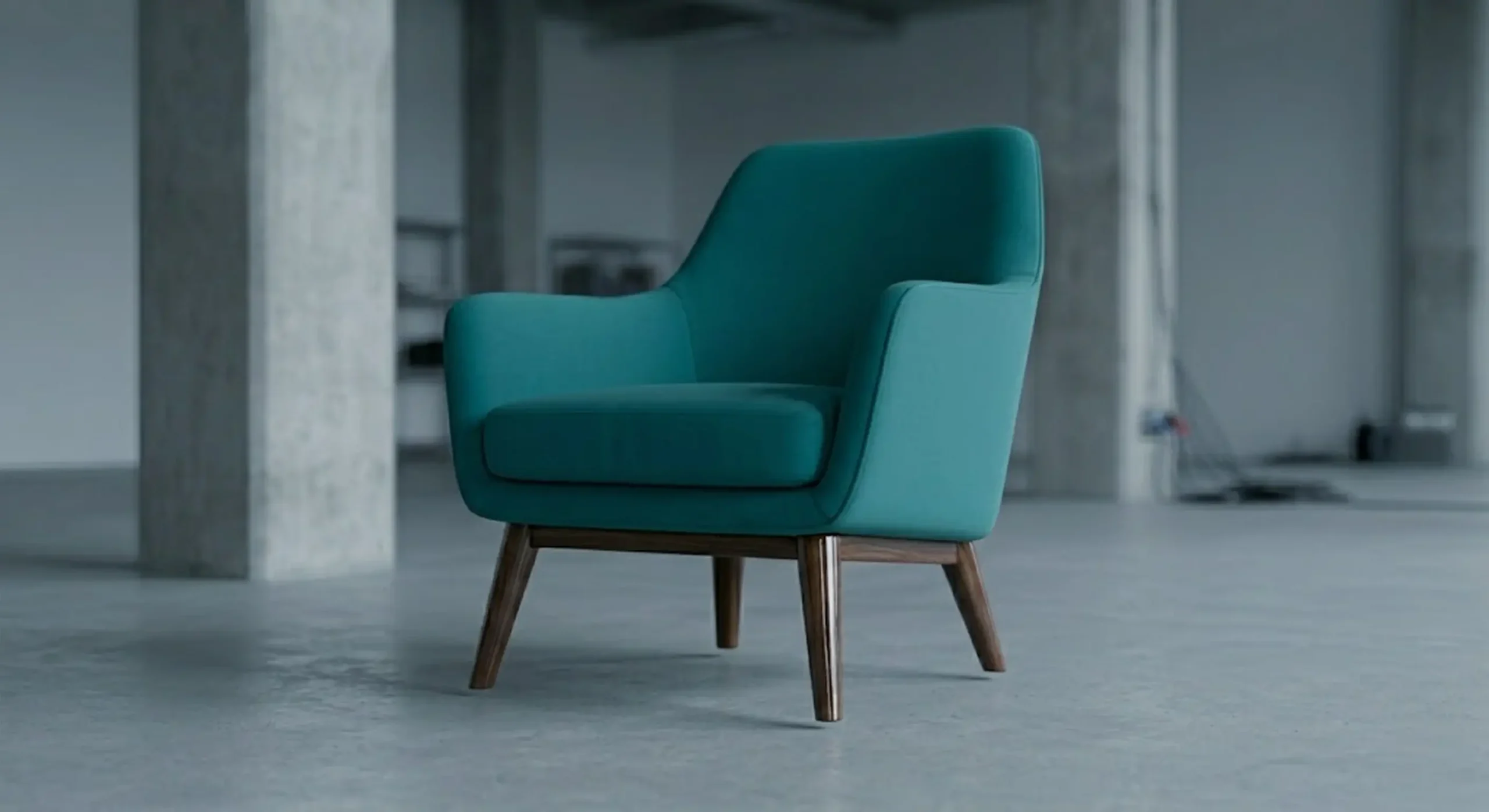
A product with no shadow, or with a crisp hard shadow that looks pasted onto the surface, immediately tells the viewer something is wrong. Shadows aren’t decorative — they communicate physical relationship. They show how heavy an object is, how far it sits from the surface below it, and what quality of light is hitting it.
Soft, graduated shadows require large light sources or heavily bounced light. A small point light produces hard-edged shadows that look theatrical. A large area light or a well-configured HDRI produces the soft, natural-looking shadow falloff you see in actual product photography. The contact shadow — the darkened zone right where the product meets the surface — is particularly important. It’s one of the first things that reveals a render as computer-generated when it’s missing or handled lazily.
We also see artists disabling ambient occlusion to cut render time. This is almost always a visible mistake. Ambient occlusion approximates the way light gets trapped in tight spaces — the darkening between a cap and a bottle body, the shadow inside a product seam, the depth between stacked objects. Without it, everything reads as uniformly lit in a way that no real environment produces.
Mistake 4: Surfaces That Are Too Perfect
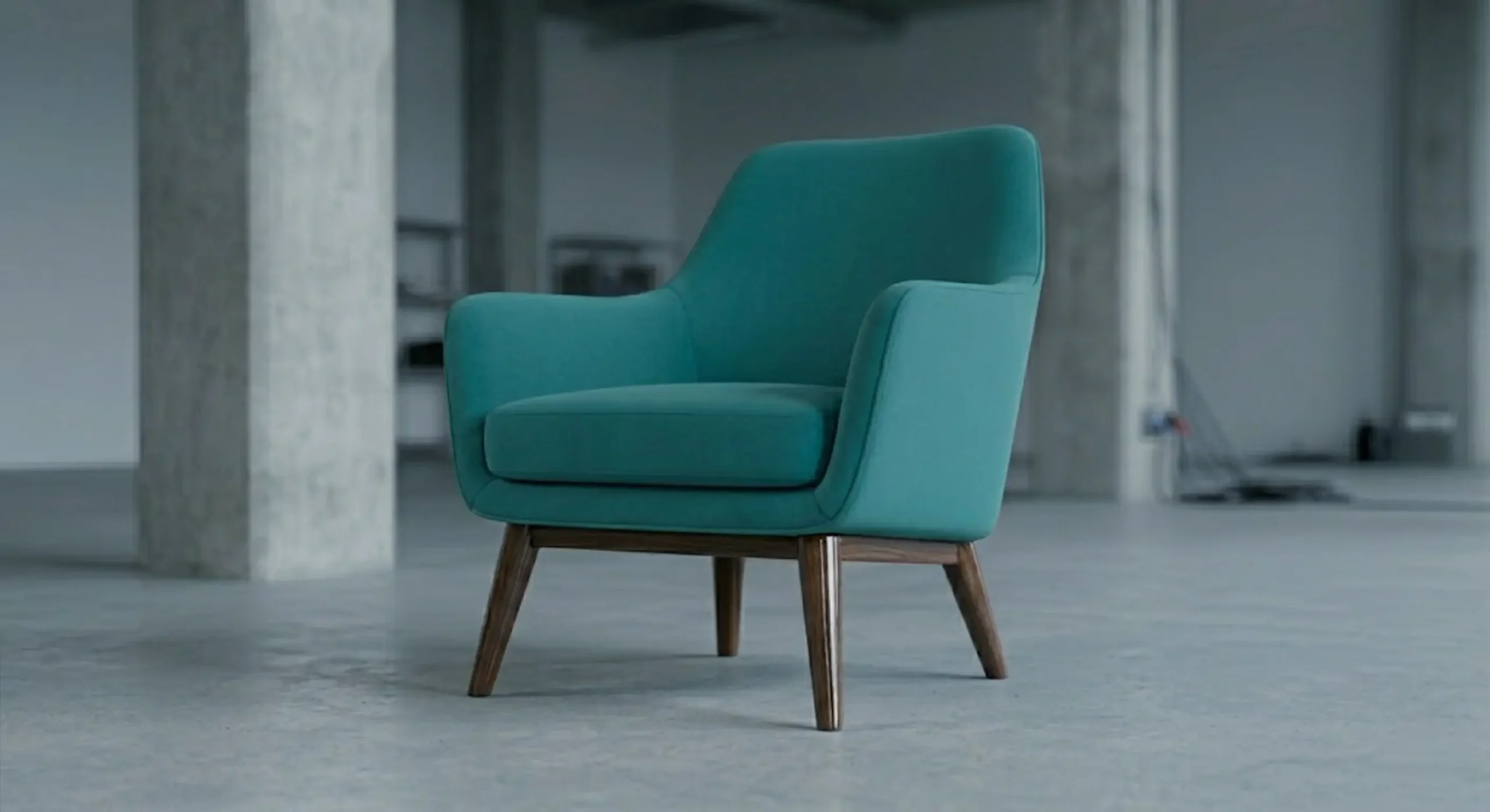
Real products are not perfect. A brushed aluminum surface has micro-scratches from the manufacturing process. Injection-molded plastic has a very subtle surface texture from the mold. A glass screen has the faint remnants of handling. These aren’t flaws — they’re the evidence that an object physically exists in the world. When a render omits them entirely, the result looks like a 3D model rather than a product.
The solution is imperfection layering — subtle roughness variation maps, micro-scratch overlays, and very faint grunge maps applied over the base material. These need to be barely noticeable at a normal viewing distance. The goal isn’t a distressed product; it’s a physically plausible one. Done right, these layers do an enormous amount of perceptual work without announcing themselves.
| Surface Type | Common Mistake | What to Add |
|---|---|---|
| Polished metal | Uniform reflectivity across the whole surface | Subtle roughness variation, micro-scratch overlay |
| Matte plastic | Flat, even roughness with no variation | Slight gloss variation, surface texture bump |
| Glass / acrylic | Perfectly clean, no surface character | Very faint smudge or edge dust map |
| Fabric / textile | Tiled texture with no color or height variation | Normal map for fiber detail, subtle color noise |
| Wood | Uniform gloss, flat grain | Gloss variation map following grain direction |
| Painted surface | Perfectly even finish | Subtle orange peel texture in specular channel |
Mistake 5: Color Temperature Mismatch Between Light Sources
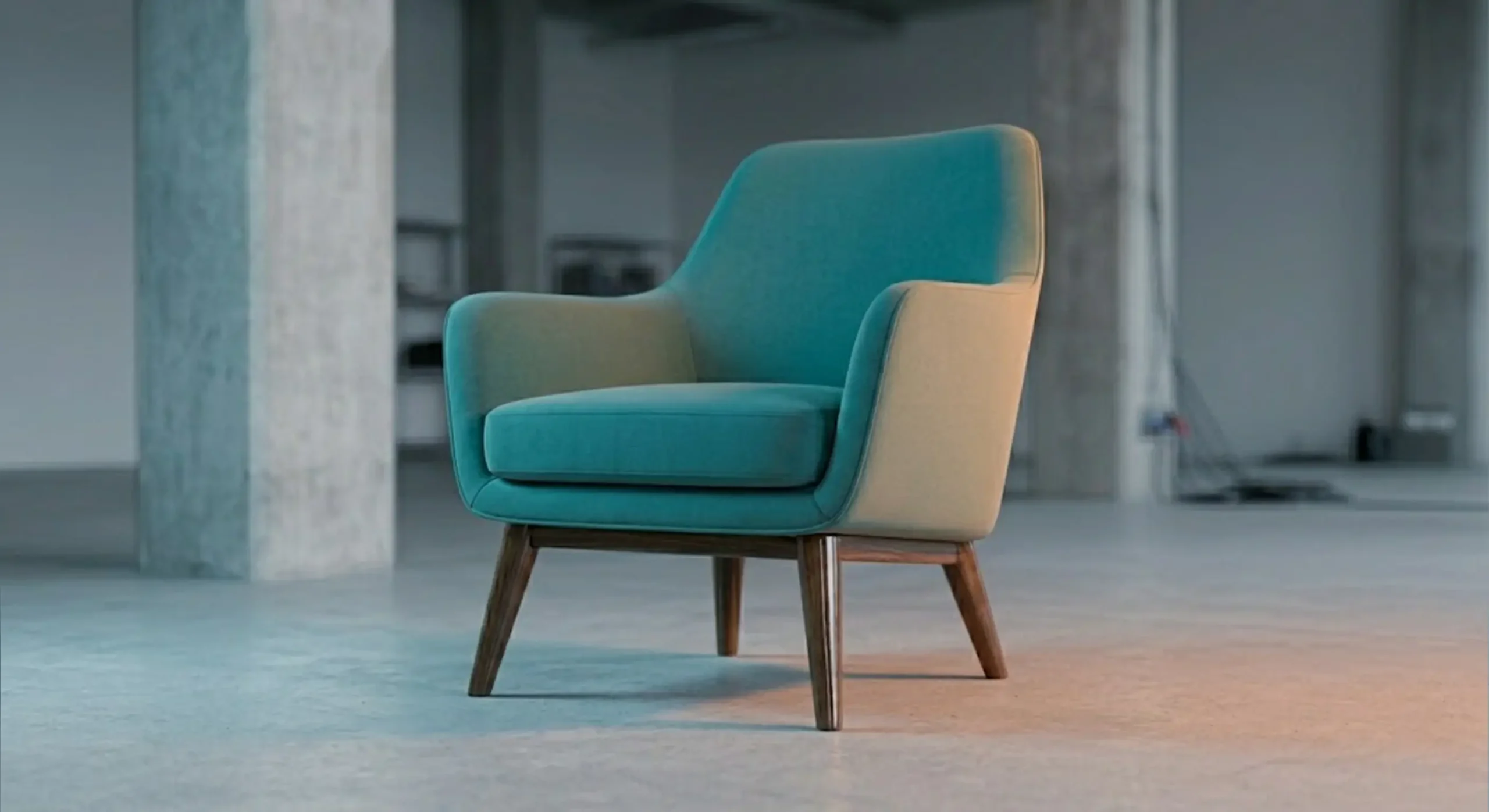
In a real photography studio, every light source is either color-matched or deliberately contrasted for creative effect. In 3D, artists frequently mix warm and cool lights without thinking about what that does to the product’s perceived color. The result: a render that looks approximately right from the primary angle but has strange green or magenta casts in the shadow regions — a classic sign of competing color temperatures that were never resolved.
This is particularly damaging for product categories where color accuracy is commercially critical: cosmetics, apparel, packaging, consumer electronics. If a brand is approving a packaging color against a render, and that render has a warm key light competing with a cool fill light that were never balanced, the render is giving the client inaccurate color information. They may approve it. Then the actual printed packaging arrives and nothing matches.
Standard practice is to define your key light’s color temperature and match your fill light accordingly. If you want deliberate warm-cool contrast for visual interest — which can work beautifully in lifestyle 3D product renders — make it an intentional creative decision and be explicit with the client that it’s stylized rather than color-accurate.
What Actually Makes a Product Render Look Convincing

When a product render reads as genuinely photographic, it’s almost never because of one spectacular element. It’s because everything is behaving consistently. The shadow softness matches the light source size. The material values are physically plausible. The imperfections are present and appropriate. The color is stable across the frame. None of these things are individually difficult to achieve. What’s hard is maintaining discipline across all of them at once, under time pressure.
That’s exactly where most fake-looking renders come from. It’s rarely a single catastrophic error. It’s several small shortcuts layered on top of each other. The HDRI wasn’t oriented. The material roughness was estimated rather than referenced. The imperfection maps were skipped. The color temperature was never checked. Stack four small problems and you get a render the client rejects but can’t clearly explain why.
The most useful quality check we use internally: open the render and ask honestly — if I printed this and held it beside the real product, would anyone need to look twice to tell the difference? If yes, something is physically inconsistent. Work back from the most obvious visual discrepancy and one of these five problems is almost always at the root of it. If you’re working with an outside studio and want to set clear expectations before production starts, it’s worth reading up on how to write the perfect brief for a 3D product rendering studio — specifying material references and color accuracy requirements upfront saves significant revision time.
Frequently Asked Questions
Why does my product render look plastic even with a metallic material applied?
Usually because the roughness value is too low and reflectivity too uniform. Real metals have surface variation even when polished. Add a subtle roughness map and reduce overall reflectivity slightly — pure mirror-finish metals are rarer than renders suggest.
Can I fix fake-looking renders in post-production?
Partially. You can adjust color temperature in compositing, and some contact shadow issues can be addressed with post-processing layers. But material and lighting problems baked into the render itself generally require going back to the 3D file. Post is not a substitute for a correctly built scene.
How do I know if an agency’s PBR workflow is actually solid before I hire them?
Ask to see close-up renders of different material types — polished metal, matte plastic, glass, fabric. Look specifically at the shadow regions and surface imperfections. If every surface looks uniformly lit and perfectly clean, that’s a workflow problem. Also ask whether they use reference photography or manufacturer texture packs for material calibration.
Does render engine choice affect how fake or real a render looks?
The engine matters less than how it’s used. Arnold, V-Ray, Corona, Cycles, and Redshift can all produce convincing results with the right material and lighting setup. A poorly calibrated scene will look fake in any engine. Focus on the fundamentals first.
If you’re looking at renders right now that fall into any of these categories — too flat, too shiny, oddly lit, or just not convincing — it’s worth a proper technical review before they go into any campaign or product listing. A render that looks artificial does real damage with buyers who have no other reference for your product’s quality. At 360render.com, diagnosing and fixing these exact problems is a core part of what our 3D product rendering services cover — whether that means rebuilding materials from reference, re-lighting an existing scene, or starting fresh with a cleaner production pipeline. Contact us and let’s take a proper look at what’s actually going wrong.
Frequently Asked Questions
Why do my 3D product renders look plastic even with realistic materials applied?
Plastic-looking renders are usually caused by incorrect roughness and specular values in your material settings. Adjust the roughness map and lower specular intensity to match real-world surface properties of your product.
What is the most common lighting mistake that makes 3D renders look fake?
Using a single, overly bright light source without any fill or ambient lighting is the top mistake that kills realism. Real environments have light bouncing from multiple directions, so use HDRI lighting or multiple light setups to simulate this.
How do I fix blown-out highlights ruining my 3D product render?
Blown-out highlights typically result from lights set too high in intensity combined with materials that have no roughness variation. Reduce light intensity, add a roughness texture, and enable proper tone mapping in your render settings.
Why does my 3D render look flat even though I used high-resolution textures?
Flat renders are often caused by missing normal maps, incorrect bump depth, or a lack of subtle surface imperfections that real objects have. Add normal maps, micro-scratches, and fingerprint overlays to give surfaces believable depth and character.