Cosmetic packaging is one of the most technically demanding categories in 3D product rendering services for cosmetics perfecting glass liquids and textures. If you’ve ever tried to photograph a glass perfume bottle in a real studio, you know the chaos — unwanted reflections, light bleeding through colored liquids in unexpected ways, metallic caps that blow out no matter where you move the softbox. That’s a big part of why cosmetic brands are increasingly turning to 3D rendering as their primary production method. A well-executed render of a serum bottle or fragrance flacon can look more controlled and more precise than the best product photograph. But “well-executed” is doing a lot of work in that sentence. Cosmetic renders that fall short don’t just look mediocre — they look artificial in a way that actively undermines the brand. The gap between a convincing cosmetic render and a poor one comes down entirely to technical decisions, and that’s what this post is about.
In our studio, we work with perfume bottles, serum vials, foundation compacts, tinted moisturizer tubes, lip gloss applicators, and everything adjacent. Each material type — borosilicate glass, colored liquid, frosted acrylic, hot-stamp foil, soft-touch matte laminate — presents its own set of optical problems. Clients often arrive assuming rendering is straightforward: build the model, apply some materials, hit render. The reality is that cosmetic products sit at the intersection of optics, material science, and lighting design. You cannot fake your way through any of those three disciplines and still produce work that sells a luxury product.
Why Glass Is the Hardest Material in Cosmetic 3D Product Rendering
Glass challenges every renderer because it does several things simultaneously — it transmits light, refracts it, reflects it, and sometimes scatters it if the surface has been etched, sandblasted, or acid-washed. A standard perfume bottle might include a clear body, a slightly tinted or colored liquid interior, a metallic collar, and an opaque cap with debossed lettering. Each of those elements interacts with every light source in the scene differently. You’re not rendering one material — you’re rendering a system of interacting materials.
The foundation of realistic glass is the Index of Refraction, or IOR. Standard soda-lime glass sits around 1.52, while crystal glass — the material that high-end fragrance packaging often mimics — has a noticeably higher IOR, which bends light more dramatically and produces that weighted, luxurious distortion you see through the walls of a Baccarat bottle. Getting this value right determines how objects are distorted when seen through the bottle. The human eye is extraordinarily good at detecting when glass “feels” right versus when it doesn’t, even without consciously knowing why.
Beyond IOR, wall thickness matters. Glass isn’t infinitely thin. As light passes through glass walls at oblique angles, it produces chromatic aberration — slight color fringing where red, green, and blue wavelengths separate slightly. In physically based renderers, this is controlled through dispersion settings. It’s a subtle detail. Most clients wouldn’t name it if asked what’s wrong with a render. But switch it off and suddenly the glass looks like a plastic shell rather than actual glass.
Caustics — the focused light patterns that appear on surfaces around a glass object — are another layer. They’re real and they matter to realism, but they’re computationally expensive and easy to handle badly. In production work, we often combine true caustic calculation with strategically placed area lights to approximate the effect at a fraction of the render time. The goal is always visual truth, not necessarily physical simulation at every step.
Rendering Liquids Inside Cosmetic Packaging
Once you have glass behaving correctly, the liquid inside adds a second system of optical complexity. Light enters the glass, refracts, enters the liquid, refracts again, travels through volume, exits the liquid, exits the glass — all with attenuation and color shifting at each stage. This is what creates the deep, glowing quality you see in high-end fragrance photography when the bottle is backlit.
For colored liquids — amber, rose, pale gold — we use volumetric absorption rather than flat-colored material shaders. Volumetric absorption means the color responds to depth: thinner parts of the liquid, near the edges of the bottle, appear lighter and more transparent, while the center reads richer and deeper. Flat-colored liquids look wrong immediately because real liquid doesn’t work that way. The eye recognizes it even if the brain doesn’t articulate the problem.
Viscosity also needs to read visually. A thick vitamin C serum sits differently in its vial than a watery toner or a lightweight face oil. We adjust the liquid’s surface — a subtle meniscus curve, an air gap at the top if the bottle isn’t completely full — to communicate the physical weight of what’s inside. These micro-details are exactly what separates a render a client will mistake for a photograph from one that clearly reads as CG.
Surface Finishes: Foil, Matte Coatings, Labels, and Embossing
The packaging surface itself is where a lot of cosmetic renders either succeed or fall apart. Modern cosmetic packaging uses a wide range of finishes — soft-touch matte laminate, UV spot gloss, hot-stamp foil, metallic screen printing, embossed or debossed type — and each is a distinct shading problem.
Matte coatings are not simply diffuse surfaces. They still have a subtle specular highlight when light catches them at the right angle — that’s exactly the characteristic feel of a premium matte-laminated box. In physically based rendering, this means setting roughness values carefully. Too rough and the surface looks chalky. Too smooth and it starts to look semi-gloss. The correct value is narrow and material-specific.
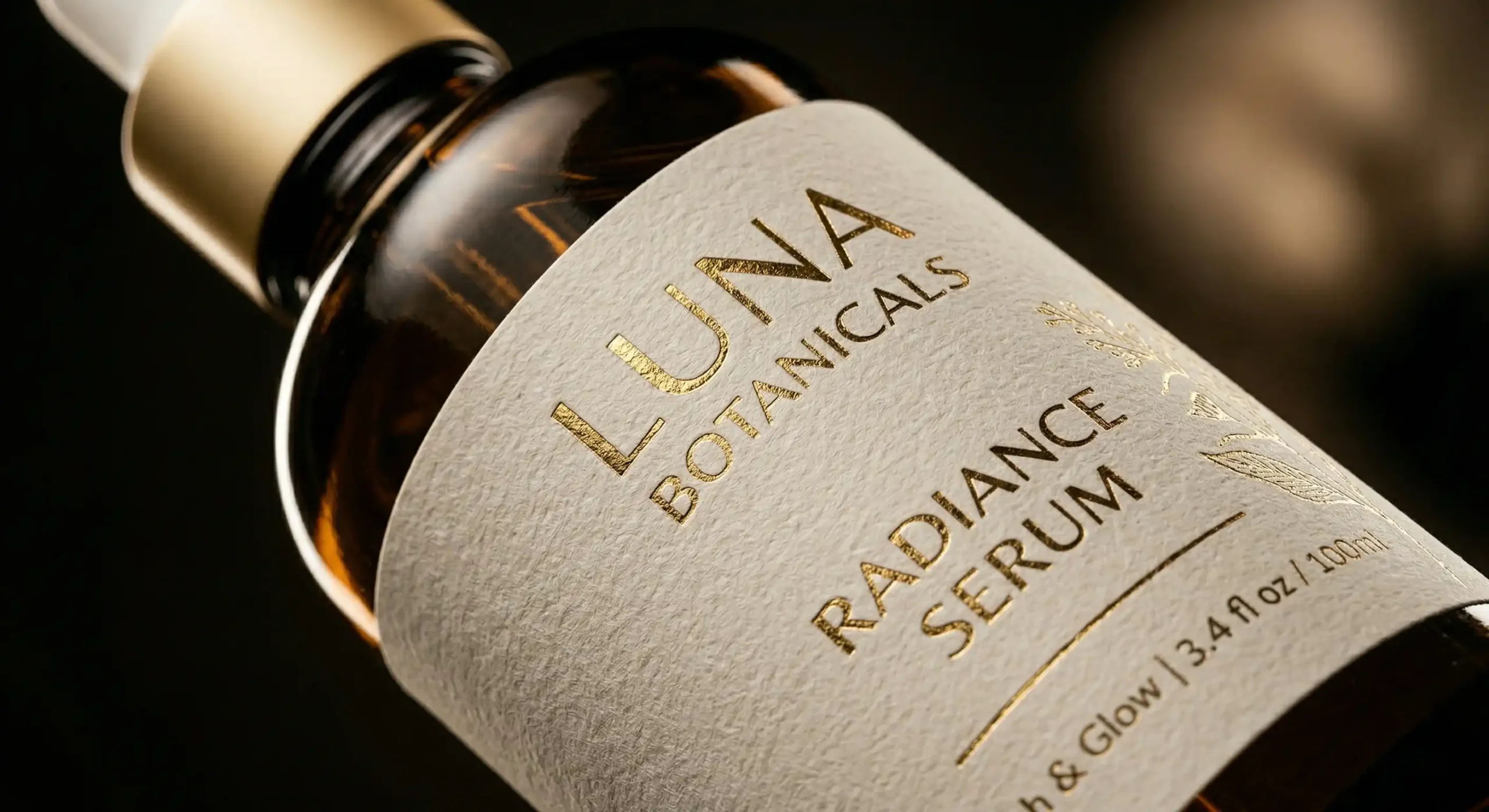
Hot-stamp foil is one of the trickiest finishes to render convincingly. It’s highly specular but not mirror-smooth — it has a micro-texture that gives it a characteristic shimmer as viewing angles change. We build foil materials using layered shaders: a base metallic layer with a precisely tuned roughness, combined with a normal map derived from real foil scans where possible. When this is done correctly, the foil glints and shifts in turntable animations in a way that’s immediately identifiable as foil rather than generic metallics.
Embossed and debossed type is another area where geometry beats texture maps at high resolution. Baked normal maps approximate embossing well at a distance, but close-up shots reveal their softness at the edges. Modeling the emboss directly into the mesh takes additional time but holds up at any zoom level and in any lighting condition. For hero shots and launch imagery, we always prefer proper geometry for this detail.
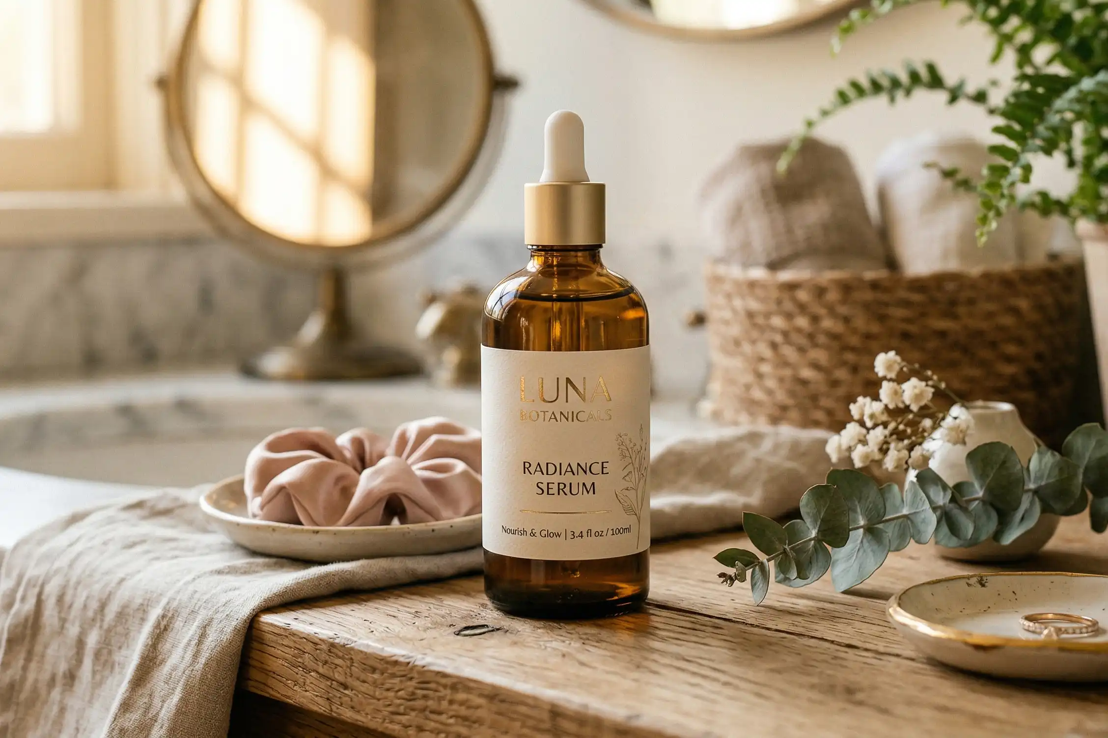
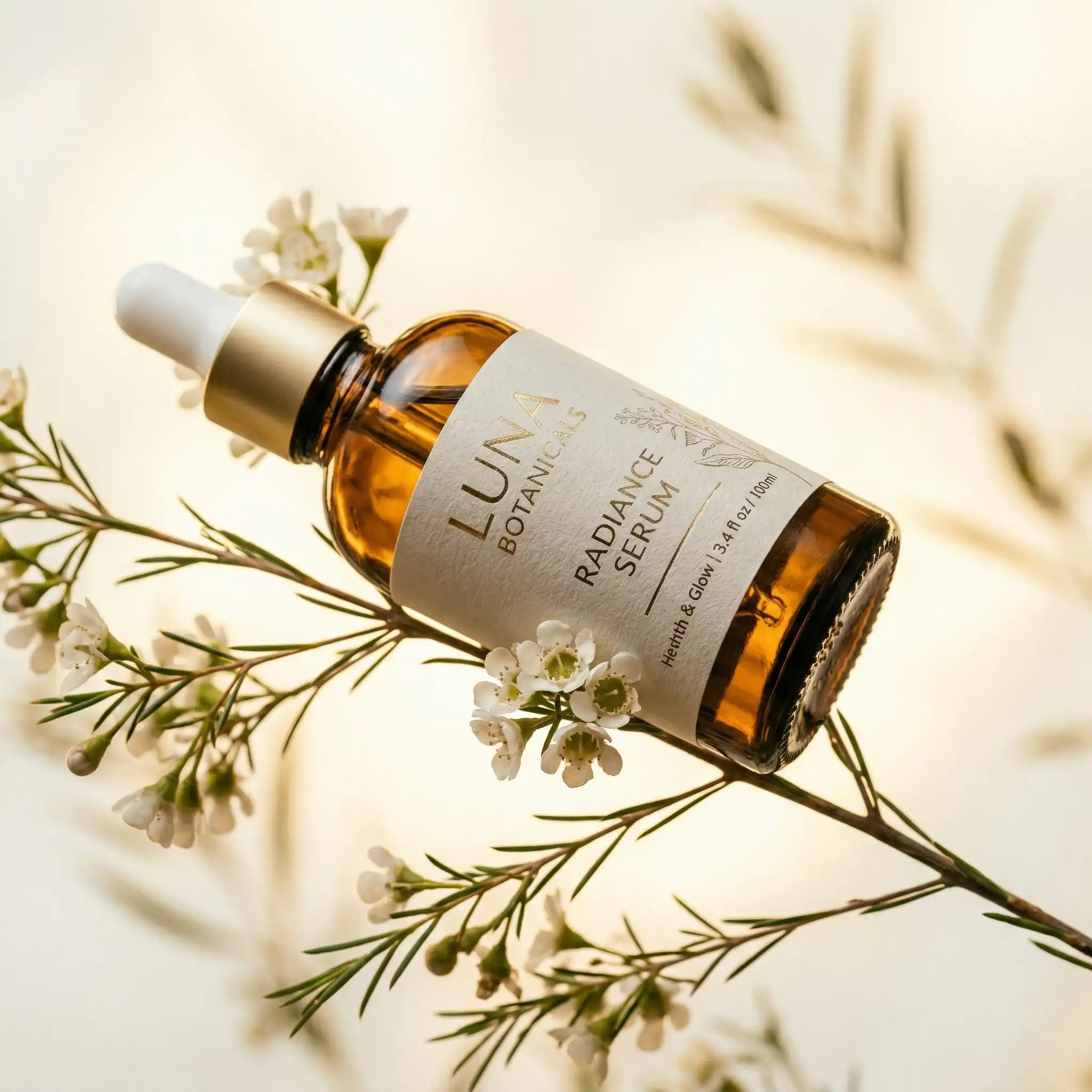
Labels — whether printed directly on glass or applied as a wrap — need accurate UV mapping that follows the curvature of the container. A label that sits geometrically flat on a curved surface reads as a decal. A realistic label has a slight physical presence, follows the form, and shows the subtle edge lift that paper or plastic labels develop in real life. It’s a small detail that contributes significantly to material credibility.
Lighting Cosmetic Products: What Actually Works
Lighting is arguably the whole game in cosmetic rendering. A technically perfect material setup can be completely ruined by bad lighting, and conversely, good lighting can mask some material limitations. We use HDRI environment lighting as a consistent base — it provides realistic ambient reflections that make glass and metallic surfaces read correctly without looking staged. But HDRI alone is never sufficient for hero product work.
Our standard cosmetic lighting setup is a variation of the beauty-tent concept — soft, wrap-around illumination from above and both sides, with a deliberate backlight positioned to create rim separation between the bottle and its background. For glass specifically, that rim light is critical. It traces the edge of the bottle and gives it volume against the background. Without it, even a technically perfect glass material reads as flat.
One of the most common mistakes we see in in-house or underdeveloped renders is symmetrical lighting. Real product photography is never perfectly symmetrical, because symmetry makes curved surfaces read as flat. We deliberately offset key lights, vary the size of area lights for different surfaces, and sometimes paint highlight passes in compositing to get exactly the right specular shape across a curved shoulder or a tapered bottle neck.
For the soft gradient backgrounds that are standard in premium cosmetic imagery, we build a separate background plane with a custom gradient material rather than using the HDRI background directly. This gives us precise control over how the product lifts from the background without fighting the rest of the lighting setup.
What Clients Get Wrong When Briefing Cosmetic Render Projects
After working on a wide range of cosmetic packaging projects, these are the brief problems that consistently slow production down. If you want to understand how to avoid them, our post on how to write the perfect brief for a 3d product rendering studio with template covers this in depth. The short version is below.
| Common Brief Problem | Why It Causes Delays | What to Provide Instead |
|---|---|---|
| Logo or flat artwork file only | Model must be built from scratch; dimensions are guesswork | CAD files, engineering drawings, or physical samples with accurate measurements |
| “Photo-real but brighter” | Overexposed renders look artificial; brightness has physical limits | Reference images showing the exact mood and exposure you want |
| No Pantone or color specification | Rendered colors may not match production packaging | Pantone codes, hex values, or brand color standards |
| Change requests after final render approval | Major revisions require resetting lighting and materials | Approve clay renders and lighting passes before committing to finals |
| No mention of finish types | Artist defaults to generic material; foil and matte look identical | Specify every finish: matte, gloss, foil, frosted, clear, metallic |
The single biggest source of delays is missing or inaccurate dimensions. If a bottle is modeled at the wrong proportions, everything downstream — materials, lighting, composition — is built on a flawed foundation. Accurate CAD data or a physical sample with measurements is genuinely the most valuable thing a client can send at project start. Knowing how to optimize your cad files for flawless 3d product renders can significantly reduce back-and-forth during this stage.
Animation and Turntables for Cosmetic Products
Static renders are the foundation, but cosmetic brands increasingly need animated visuals for e-commerce, paid social, and digital advertising. Turntable animations are particularly well-suited to cosmetic packaging because the shifting viewing angles show off foil, glass distortion, and liquid depth in ways a static image simply cannot. The material setup becomes more demanding in animation — anything that reads acceptably in a still image can flicker or behave inconsistently across frames if the shaders aren’t physically grounded. We use path-traced rendering for all client animation work, which means longer render times but stable, consistent quality across every frame.
Liquid animation — pouring, drops falling, product being dispensed — requires fluid simulation in addition to the material work. When a brief includes this, it needs to be scoped correctly from the start. Fluid dynamics is a specialist discipline that adds significant time and complexity. It’s entirely achievable, but it’s not a small addition to a standard packaging render — it’s a separate workstream.
For brands considering how animated cosmetic renders fit into a broader product marketing strategy, it’s worth looking at how 3d lifestyle scenes for product rendering how to show your product in context and drive more sales can extend the value of the same base assets across multiple deliverables.
The Technical Standard That Makes Cosmetic Renders Convincing
The brands that get the most from cosmetic rendering are the ones who understand that realism comes from accumulated technical precision, not from a single decision or a particular software package. Correct IOR values, volumetric liquid materials, accurate surface finish shaders, offset lighting, proper label geometry — each of these is a relatively small contribution. Together, they create the image the viewer’s brain reads as real.
The counterpart of this is also true: each technical shortcut compounds. A flat-colored liquid in a glass bottle with symmetric lighting and a baked normal map for the embossing won’t fool anyone. The sum of approximations adds up fast.
Whether you’re preparing launch imagery before physical samples exist, building an e-commerce catalogue across multiple SKUs and colorways, or producing animated assets for a fragrance campaign, professional cosmetic rendering gives you control that studio photography cannot match. You can change liquid color without reformulating, swap label designs without reprinting, test six background treatments in an afternoon. That flexibility is real — but it only delivers when the underlying technical work is done properly.
If you’re ready to discuss your cosmetic packaging project, contact us at 360render.com. We’ll review your brief, identify exactly what assets we need from your side, and walk you through the production stages before a single render is produced.
Frequently Asked Questions
How does 3D rendering replicate the optical properties of glass cosmetic packaging?
Physically based rendering uses accurate Index of Refraction values, dispersion settings, and multi-layer material shaders to simulate how light transmits, refracts, and reflects through glass. Combined with volumetric absorption for liquid contents and caustic lighting effects, this produces glass that reads as optically correct rather than as a CG approximation.
Can 3D rendering show the difference between a thick serum and a watery toner inside a bottle?
Yes. Viscosity and surface behavior are simulated through subtle geometry adjustments to the liquid surface — meniscus curves, air gaps, slight surface tension details — combined with appropriate volumetric material settings. The result communicates the physical weight and behavior of different formulations.
What file formats are most useful when commissioning cosmetic renders?
CAD files in STEP or IGES format are ideal for packaging geometry. If those aren’t available, accurate engineering drawings or physical samples with precise measurements are the next best option. Flat artwork files like AI or PDF are useful for label artwork but cannot substitute for dimensional data.
Is 3D rendering suitable for cosmetic packaging that doesn’t physically exist yet?
Yes, and this is one of rendering’s most practical applications. Brands regularly commission renders before production tooling is finalized, using renders for pre-launch marketing, investor decks, and retailer presentations. Changes to color, finish, or label design can be made in the render without any physical production cost.
Frequently Asked Questions
How does 3D product rendering capture the realistic look of glass cosmetic packaging?
3D rendering uses advanced ray-tracing and light simulation techniques to replicate how glass reflects, refracts, and transmits light with photorealistic accuracy. This eliminates the need for expensive physical prototypes while delivering marketing-ready visuals indistinguishable from real photography.
Can 3D rendering accurately show liquid textures like serums, oils, and foundations?
Yes, specialized rendering software simulates fluid transparency, viscosity, and light interaction to make liquids appear lifelike and true to their actual consistency. This is especially valuable for showcasing product color payoff and formulation quality before a product even launches.
What are the cost benefits of using 3D rendering services over traditional cosmetics photography?
3D rendering eliminates costs associated with physical samples, studio rentals, lighting setups, and retouching, often reducing production expenses by 40–60%. It also allows unlimited revisions and reuse of assets across multiple campaigns without additional shooting costs.
How long does it take to receive a completed 3D cosmetic product render?
Turnaround time typically ranges from 3 to 7 business days depending on the complexity of materials like glass, liquid, and texture details. Rush delivery options are often available for brands with tight launch deadlines.