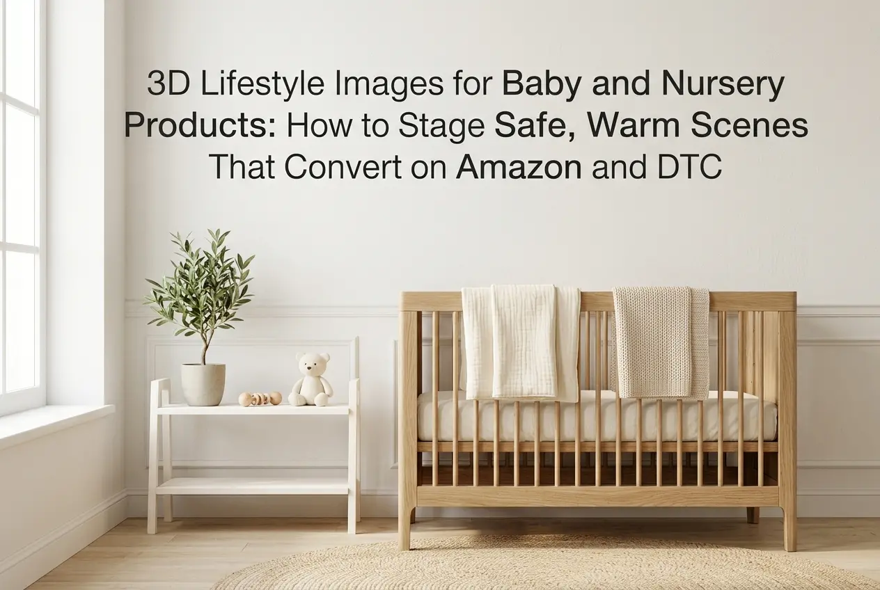
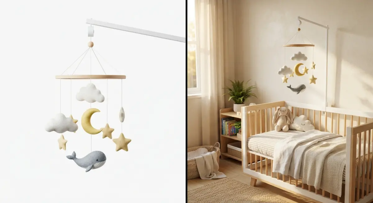
A crib photographed against a plain white cyberhorizon tells a shopper almost nothing except the dimensions. A crib photographed in a soft, sunlit nursery with a folded muslin blanket and a hint of a rocking chair in the background tells a parent this is safe, this is calm, this is where my baby sleeps. That emotional leap is exactly why brands in the baby category have shifted so much of their catalog budget toward 3D Lifestyle Images for Baby and Nursery Products: How to Stage Safe, Warm Scenes That Convert on Amazon and DTC. Parents don’t buy nursery furniture on specs alone — they buy on trust, and trust is built through atmosphere.
We’ve rendered a fair number of nursery and baby-gear scenes in our studio, everything from bassinets and gliders to teething toys and diaper caddies, and the pattern is consistent. The products that convert best in lifestyle shots aren’t the ones with the flashiest camera angles. They’re the ones that feel like a real room a real parent decorated, lit the way morning light actually falls through a window, with textures soft enough that you can almost feel the cotton. Getting there with 3D is a very different process than staging a physical photo shoot, and it comes with its own rules.
Why 3D Makes Sense for Baby and Nursery Product Photography
Physical photo shoots for nursery products are expensive in a way that’s easy to underestimate. You need a full nursery set — crib, rug, curtains, wall art, plants — plus a stylist to arrange it, a photographer to light it, and often a rented space because most studios don’t have a nursery built into their backdrop inventory. Then you do it again for every color variant and every new SKU.
With 3D, we build the room once. Swap the crib finish from white to walnut, change the wall color from sage to blush, add a mobile toy or remove it — all without re-renting a room or re-stitching a set. For a baby brand launching a crib in four colorways, that’s four renders, not four flights and four days of set-building.
There’s also a safety and liability angle that’s specific to this category. You can’t put a real infant in a crib for a stock photo — most brands use dolls or leave the crib empty, both of which look slightly off if you look closely. In 3D, we can add a subtly rendered sleeping infant silhouette or, more commonly, style the crib as beautifully made-up and empty, which parents actually prefer because it lets them project their own child into the scene.
What “Safe” Actually Means in a Nursery Render
This is the part that trips up teams who treat nursery renders like any other lifestyle category. Baby products live under more scrutiny than almost anything else in e-commerce, and the imagery needs to reflect current safety guidance, not just look pretty.
- No loose bedding in cribs. Bumpers, pillows, and blankets draped inside a crib photograph beautifully but contradict safe-sleep guidance. We keep crib interiors to a fitted sheet only, and style soft goods around the crib instead — folded on a nearby chair, hung on a wall hook, draped over the side rail from outside.
- Correct product orientation and hardware. Buyers zoom in on assembly details. If a rendered crib shows a mattress support at the wrong height or missing hardware, that’s a return waiting to happen, and sharp-eyed shoppers will call it out in reviews.
- Cord and cable realism. Nightlights, monitors, and sound machines need believable cord routing, not cords floating mid-air or draped across a crib rail where a real cord would be a hazard.
- Age-appropriate toy placement. A toy shown inside a crib scene needs to match what’s actually safe for a sleeping infant’s age range. We check this against the product listing before final render, not after.
None of this is about being preachy — it’s about not giving a competitor or a picky reviewer an easy reason to flag the image as misleading. Baby product listings get reported more often than most categories, and an inaccurate lifestyle shot is a fast way to lose a listing to a policy strike.
Staging Warmth Without Overdoing It
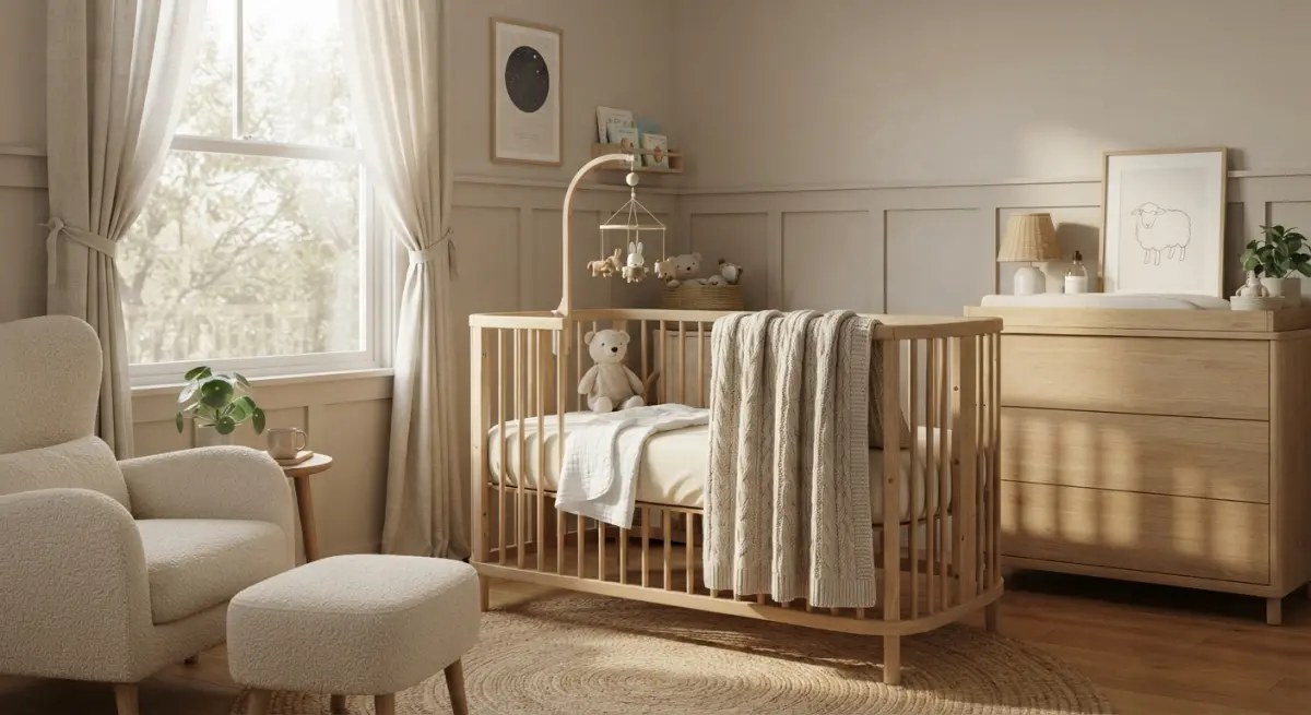
Warmth in a nursery scene comes from three things: light temperature, material softness, and restraint. Get any one of these wrong and the whole scene reads as either sterile or cluttered.
Lighting Temperature
We almost always push nursery scenes toward a warmer color temperature than we’d use for, say, a tech product or office furniture render. Late-afternoon window light, somewhere in the warm-white range, gives skin tones and wood finishes a gentle glow without tipping into an orange cast that makes whites look dingy. We’ll often place a soft secondary light source — a lamp, a nightlight, string lights — to add a second warm accent without competing with the main light.
Material Softness
This is where a lot of generic renders fall flat. Fabric in a nursery scene needs visible weave and a bit of wrinkle — a perfectly smooth, plastic-looking blanket reads as fake instantly, even to someone who couldn’t tell you why. We spend real time on cloth simulation for muslins, quilts, and rug fibers because these are the textures a parent’s eye lingers on longest.
Restraint in Styling
The instinct is to fill the frame — more toys, more plants, more wall decor — but cluttered nursery scenes actually undercut trust. A crowded room looks like a photo shoot, not a home. We usually stage three to five supporting props per scene: one plant, one soft toy, one piece of wall art, maybe a folded blanket. That’s it. The product stays the visual anchor, and the room reads as lived-in rather than staged.
Camera Angles That Actually Sell
Nursery lifestyle shots work best from a slightly lowered camera height — closer to where a parent would actually stand while leaning over a crib or picking up a diaper caddy, rather than a straight-on catalog angle. This does two things: it makes the product feel human-scaled, and it lets the background soften naturally through depth of field, which pulls focus back to the product without needing heavy post-production blur.
For Amazon specifically, we still recommend keeping one hero lifestyle shot fairly straight-on and centered, since that image often gets used as a secondary thumbnail in search results before a shopper even clicks through. The more atmospheric angled shots work better further down the gallery, where the shopper is already engaged and looking for reassurance rather than information.
Amazon vs. DTC: Different Jobs for the Same Image
| Aspect | Amazon Listing | DTC Website |
|---|---|---|
| Primary goal | Stop the scroll, build instant trust in a crowded grid | Build brand feel, encourage longer browsing |
| Color grading | Slightly punchier, higher clarity to hold up as a thumbnail | Softer, more editorial grading matching brand palette |
| Prop density | Minimal, product stays dominant even at small sizes | Can support richer styling since images display larger |
| Aspect ratio | Square or near-square for gallery consistency | Wide banner crops for hero sections, plus square for grids |
| Text overlay | Often none, or Amazon-compliant infographic overlays only | Frequently layered with brand copy in the web design |
We generally render the master scene once at high resolution and then produce platform-specific crops and color passes from that master, rather than rebuilding the scene twice. It keeps the visual identity consistent whether the shopper first sees the crib on Amazon or lands on the brand’s own site through a retargeting ad.
What Clients Get Wrong (and How to Fix It Fast)
The most common mistake we see is treating the nursery background as an afterthought — sending us a product file and saying “put it in a nice room” with no reference. A nice room to one brand is minimalist Scandinavian; to another it’s a warm boho palette with rattan and terracotta. We always ask for a mood board or at least three reference images before starting, because guessing wrong on style means a full re-render, not a quick tweak.
The second mistake is skipping compliance review until after the render is done. It’s much cheaper to catch a bumper-in-the-crib issue or a mis-scaled toy at the concept-sketch stage than after a finished render, lit and rendered at full resolution, needs to be reworked.
The third is under-ordering angles. Nursery categories tend to have longer consideration cycles — parents research more before buying — so a single hero lifestyle image often isn’t enough. We usually recommend at least one wide establishing shot, one close detail shot showing texture and hardware, and one shot showing scale next to a recognizable object, since crib and furniture dimensions are hard to judge from a photo alone.
Bringing It Together
Nursery and baby product renders sit at an interesting intersection of emotional selling and regulatory caution, and that combination is exactly why it pays to work with a studio that’s rendered this category before rather than treating it like any other lifestyle shoot. Getting the light warm, the fabric soft, the styling restrained, and the safety details correct all at once is less about artistic flair and more about knowing where the traps are.
If you’re planning a launch or refreshing an existing nursery catalog, our 3D lifestyle rendering services team can walk you through mood boards, safety-compliant staging, and platform-specific crops before a single frame gets rendered. Reach out through our contact page and we’ll help you figure out exactly what your catalog needs.
Frequently Asked Questions
What are 3D lifestyle images for baby and nursery products?
3D lifestyle images are computer-generated renders that place baby and nursery products in realistic home settings, such as a crib mobile shown in a softly lit nursery. They replace or supplement traditional photography by using 3D modeling software to create photorealistic scenes without a physical photoshoot. This approach allows brands to visualize products in multiple room styles, angles, and lighting conditions quickly and affordably.
How do 3D renders help improve Amazon conversion rates for baby products?
3D lifestyle renders help shoppers visualize how a product fits into a real nursery, building emotional trust and reducing purchase hesitation, which directly impacts click-through and conversion rates on Amazon listings. They also allow brands to showcase safety features, scale, and context in the main and secondary image slots, addressing common parent concerns before they read the bullet points. Studies on ecommerce imagery consistently show that contextual lifestyle images outperform plain product shots in add-to-cart rates.
What safety considerations should be followed when staging nursery product scenes in 3D?
Scenes should avoid depicting unsafe practices, such as loose blankets, pillows, or crib bumpers in a sleep environment, since these can mislead parents and violate Amazon's policies on safe sleep imagery. Renders should reflect actual product use consistent with manufacturer guidelines and AAP safe-sleep recommendations to avoid misrepresenting the product. Working with a 3D artist familiar with juvenile product compliance ensures the final images are both realistic and responsible.
How can brands make 3D nursery scenes look warm and authentic rather than artificial?
Warmth comes from thoughtful lighting choices like soft golden-hour tones, realistic textures such as woven blankets or wood grain, and natural clutter like a stuffed animal or folded onesie nearby. Using high-quality HDRI lighting maps and subtle depth-of-field blur mimics real photography, making the render feel like a candid moment rather than a sterile CGI scene. Partnering with an experienced 3D visualization studio that understands color grading and composition is key to avoiding an artificial, plastic look.
Is it cheaper to use 3D lifestyle images instead of traditional photography for baby product listings?
Yes, 3D lifestyle imagery is typically more cost-effective at scale because a single 3D model can be reused across multiple scenes, angles, and seasonal updates without re-booking models, studios, or nursery sets. This eliminates recurring costs like baby models, prop styling, and location rentals while allowing faster turnaround for new product variations or A/B testing different lifestyle contexts.