Food and beverage packaging is one of the most technically demanding subjects in product visualization, and if you’ve ever wondered why some CGI renders look photorealistic while others feel flat or “off,” the answer almost always comes down to material fidelity. 3D Rendering for Food and Beverage Packaging: How to Get Labels, Foils, and Shrink Wraps Right is a question we get asked constantly — by brand managers, packaging designers, and e-commerce teams who need imagery before their physical samples are even produced. It sounds straightforward until you’re actually inside a 3D application trying to replicate a holographic foil label on a glass bottle, or a tight PET shrink sleeve with print distortion baked in. There’s a lot that can go wrong, and most of it is invisible to the untrained eye until it’s too late.
We work across a wide range of product categories at our studio, but food and beverage packaging presents a uniquely dense set of material challenges. You’re dealing with substrates that interact with light in completely different ways — matte paper, glossy laminate, metallized foil, transparent film — often stacked on a single label. Then you add the shape of the container itself: a curved bottle, a tapered can, a hexagonal jar. The label has to conform to that geometry convincingly. And all of this has to read correctly under multiple lighting scenarios because your client needs the image for a white-background e-commerce shot, a lifestyle kitchen scene, and maybe a dark moody bar setting. Getting this right requires more than a good renderer. It requires a disciplined workflow and a real understanding of how packaging materials actually behave.
This post breaks down the technical approach we use — covering labels, foils, metallic films, and shrink wraps specifically — and flags the most common mistakes that end up costing clients revision rounds and time.
Why Food and Beverage Packaging Is Harder Than It Looks
Most product renders are about surfaces. Packaging renders are about systems of surfaces. A single beer bottle might have: a base glass material with internal refraction, a paper label with a matte coating on one layer and a gloss UV spot varnish on specific graphic elements, a metallic foil stamp on the brand name, and a neck label printed on a clear film with a semi-transparent window. Each of these has its own reflectance model, its own roughness curve, its own interaction with backlighting and rim lighting.
The physical world handles all of this naturally because light just does what physics tells it to. In 3D, you’re manually recreating every single one of those physical behaviors using shader networks, texture maps, and lighting setups. If your roughness map on the matte label is slightly off, the whole container looks like it’s made of plastic. If your foil shader doesn’t have the right anisotropic spread, the gold stamp looks like painted yellow instead of metallic film. These are small mistakes with large consequences in food and beverage, because the packaging is the product in the consumer’s mind.
3D Rendering for Food and Beverage Packaging: Getting Labels Right
Labels are where most studios cut corners without realizing it. The common mistake is to apply a flat texture to the container geometry and call it a day. That works for a basic product sheet but falls apart under scrutiny. Here’s what actually needs to happen:
Substrate Differentiation
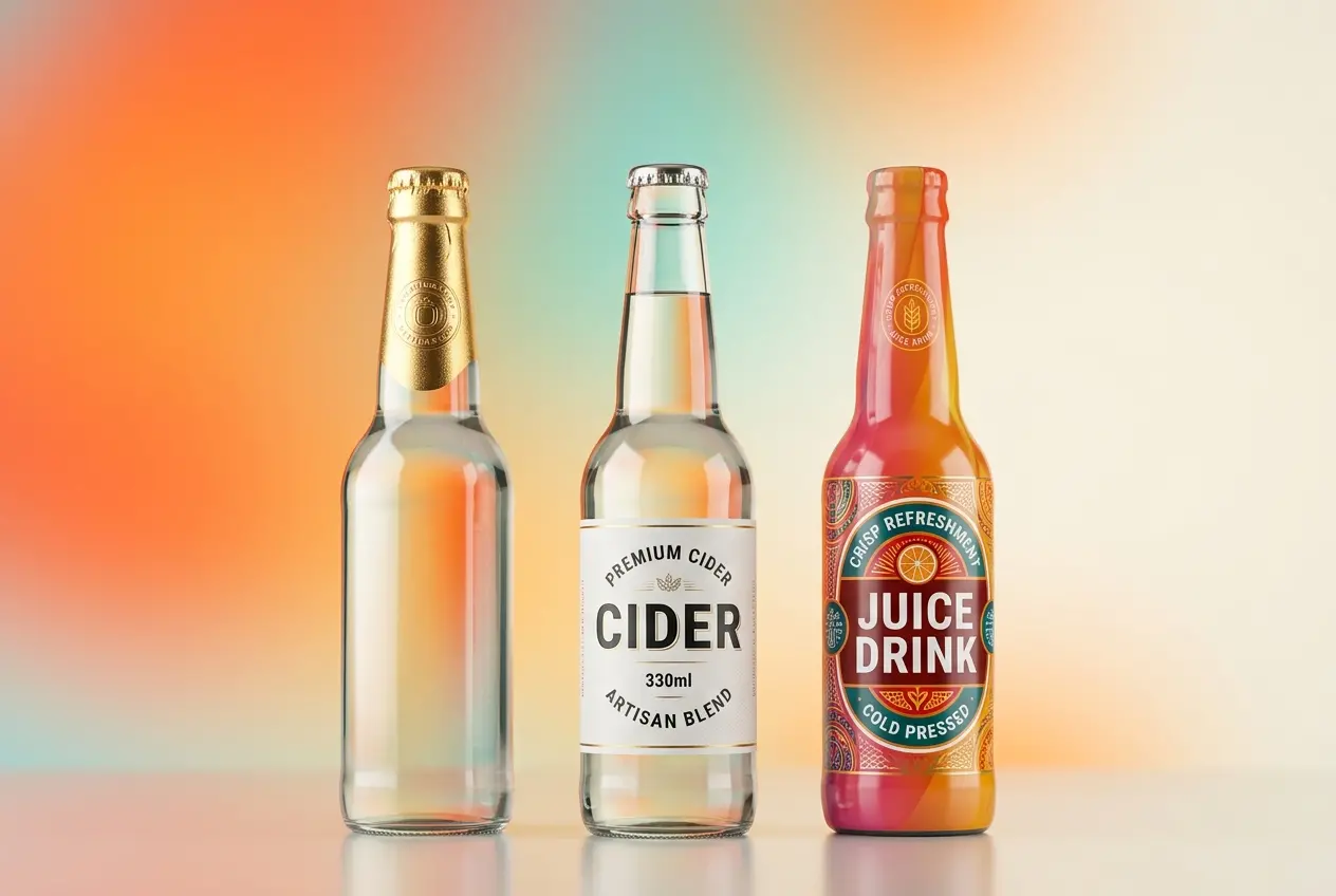
A paper label and a BOPP (biaxially oriented polypropylene) film label behave completely differently. Paper has a diffuse, slightly rough surface that absorbs light. BOPP is semi-gloss or high-gloss and creates sharp specular highlights. In your shader, this means separate roughness values, separate IOR (index of refraction) settings, and often separate normal maps. Paper labels also tend to have a slight texture — you can see the fiber structure under raking light. A subtle normal map simulating paper grain goes a long way toward believability.
Layered Coating Effects
Many labels use selective coatings — gloss UV varnish on the logo, matte on the background, soft-touch on a premium panel. You can’t fake this with a single texture. You need a multi-layered material approach, typically using a mask to separate the coated areas from the uncoated ones. In our studio, we build a “coating mask” from the print file itself, converting spot varnish layers from the dieline into grayscale maps that drive gloss values in the shader. This is technical but it’s what separates a professional render from a decent one.
Edge Behavior and Label Curl
Real labels have edges. They don’t float flush against the container — there’s often a very slight lift at corners, especially on curved surfaces. Adding a subtle displacement or geometry offset at label edges adds a layer of realism that’s subliminal but effective. Same with label curl on paper substrates. Even a 0.5mm lift at the bottom edge of a paper label makes the render feel physically grounded.
Foils, Metallic Inks, and Hot Stamping
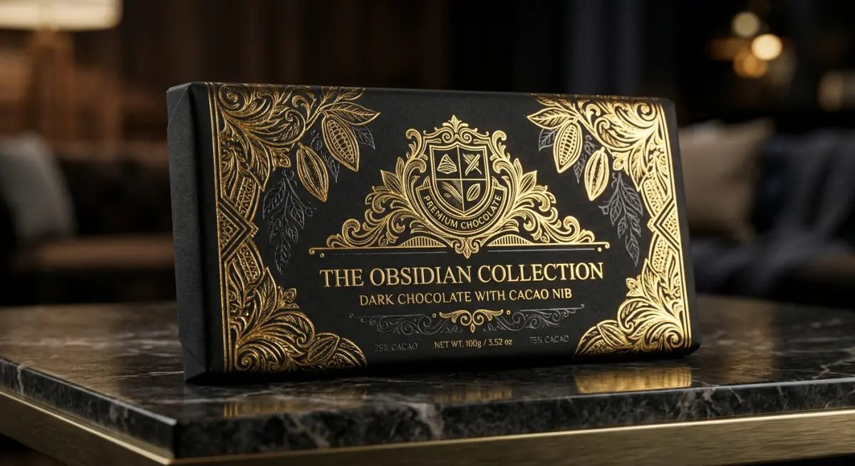
This is where renders either look luxurious or look cheap. Foil stamping — gold, silver, holographic, or colored — is a defining element of premium food and beverage packaging, and it’s notoriously difficult to reproduce in CGI because it requires understanding anisotropy.
Real foils have a directional grain from the manufacturing process. When light hits them, the reflection spreads in one direction more than the other, creating that characteristic “brushed metal” shimmer you see on a gold stamp as you tilt the bottle. In 3D, this means using an anisotropic BRDF (Bidirectional Reflectance Distribution Function) with the correct rotation and spread. The common mistake is using a basic metallic shader with high reflectivity — it looks shiny, but it doesn’t move the way foil moves. The anisotropy is what creates the visual distinction between “expensive foil” and “painted gold.”
Holographic foils are another level entirely. True holographic simulation requires either pre-baked iridescent texture maps generated from real foil scans or a procedural shader that shifts hue based on viewing angle. We typically use a combination — a scanned foil pattern as a base, with a gradient-based hue rotation driven by camera angle data. It’s not a quick setup, but holographic packaging renders that actually look holographic are rare, and clients notice the difference immediately.
Shrink Wraps and Sleeve Labels: The Geometry Challenge
Shrink wraps are technically the most involved element in food and beverage packaging visualization. A shrink sleeve label wraps around an entire container — often a complex shape — with the printed graphics intentionally distorted at the artwork stage to compensate for the deformation during the shrink process. In real life, heat causes the film to conform perfectly. In 3D, you have to simulate this manually.
The geometry approach matters here. If you simply project a flat texture onto a bottle shape, the graphics will stretch incorrectly around curves, taper points, and the base. The right method is to model the sleeve as a separate piece of geometry — usually a displaced mesh that follows the container’s silhouette with a small offset — and then UV unwrap it with the same distortion logic used in the actual print artwork. Some studios use cloth simulation to “shrink” the sleeve geometry around the container, which produces very accurate results but adds significant simulation time.
Material properties for shrink film are important too. PET shrink film has a very slight transparency — you can often see the container through thin areas of the design, especially around the base or neck. A clearcoat layer with very low roughness and a slight transmission value captures this correctly. Don’t make the film opaque. Real shrink wrap isn’t opaque.
| Material Type | Key Shader Properties | Common Mistakes |
|---|---|---|
| Paper Label | High roughness, diffuse dominant, fiber normal map | Too glossy, no surface texture |
| BOPP Film Label | Low roughness, moderate IOR, slight transmission | Treated as opaque like paper |
| Hot Stamp Foil | Anisotropic metallic, directional highlight spread | Basic metallic with no anisotropy |
| Holographic Foil | Iridescent map + view-angle hue shift | Just rainbow gradient, no pattern detail |
| PET Shrink Sleeve | Low roughness, slight transmission, conformed geometry | Flat texture projection, fully opaque film |
| Metallic Ink Print | Mid reflectivity, rougher than foil, diffuse component present | Treated same as foil — too mirror-like |
Lighting and Environment: What the Packaging Industry Actually Needs

Food and beverage clients usually need renders across multiple use cases — clean white backgrounds for retail listings, lifestyle scenes for social media, and sometimes dark dramatic setups for spirits or premium teas. The challenge is that your shader has to perform correctly across all of them, which means you can’t cheat with baked lighting or pre-lit textures.
We build all food and beverage packaging shaders to be environment-agnostic — meaning they respond correctly whether you drop them into a bright studio HDRI or a moody sunset scene. This requires physically accurate shaders, not “looks good in this one light” approximations. If a foil only reads correctly in one specific lighting setup, the artwork team has rebuilt the wrong thing.
For e-commerce white backgrounds specifically, the rim lighting approach matters enormously. Transparent bottles and cans need a light source behind them to show the liquid fill and reveal the container’s form. Without this, even a perfect 3D model looks like a flat cutout. A thin, tight rim light placed about 160–170 degrees from the camera axis is usually the right starting point.
What Clients Get Wrong When Briefing Packaging Renders
The biggest problem we see isn’t technical — it’s the briefing stage. Clients often send low-resolution label artwork or a final print PDF without the layer structure intact. To build the coating masks, foil separations, and window cutouts we described above, we need the original layered artwork file — ideally the design application source file (AI, PSD, or Illustrator with layers) rather than a flattened export. Spot colors need to be identified and labeled. Foil areas need to be on separate layers.
The second common issue is not providing physical samples or a technical datasheet for the container itself. If we’re modeling a custom bottle, we need either a 3D CAD file from the bottle manufacturer or accurate technical drawings with dimensions. Guessing bottle geometry from a photo introduces errors that compound when the label has to conform to that geometry.
Finally, clients sometimes underestimate how much the fill matters. An empty transparent bottle looks very different from a bottle with 750ml of amber liquid. The liquid fill changes how light refracts through the glass, which affects how the label reads on the back face. If you want the render to represent how the product will actually look on shelf, the fill material — its color, opacity, and density — needs to be modeled correctly.
Conclusion
Food and beverage packaging visualization is a specialist discipline. It rewards technical precision in shader building, geometry setup, and lighting strategy — and punishes shortcuts in ways that are immediately visible to anyone who has handled the real product. Done well, it gives you photorealistic imagery before your packaging is ever printed, which means you can catch issues, test colorways, and build marketing assets while your physical samples are still in production.
At 360render.com, we handle the full complexity of this workflow — from layered label artwork translation to anisotropic foil shaders and shrink sleeve geometry. If you’re working on a packaging launch and need renders that actually hold up to scrutiny, explore our product 3D rendering services or get in touch with our team to discuss your project in detail. We’re happy to look at your artwork files and tell you exactly what’s possible.
Frequently Asked Questions
What software is best for 3D rendering food and beverage packaging with realistic foil and metallic label effects?
Software like Cinema 4D, Blender, and KeyShot are widely used for food and beverage packaging renders because they offer advanced material shaders that can simulate metallic foils, holographic effects, and spot UV coatings with high accuracy. KeyShot is particularly popular in the packaging industry due to its real-time rendering engine and extensive library of pre-built material presets for aluminum, chrome, and brushed metal finishes. For teams needing tight integration with dieline workflows, Esko Studio and ArtiosCAD also provide specialized packaging-focused 3D rendering capabilities.
How do you accurately simulate shrink wrap distortion and label stretch in 3D packaging renders?
Simulating shrink wrap distortion requires using cloth or mesh deformation tools within your 3D software to mimic how the film conforms and tightens around the container's curves and edges. Tools like Blender's cloth simulation or specialized plugins in Cinema 4D allow artists to apply tension maps that replicate the wrinkling, bunching, and label stretching that occurs during the heat-shrink process. It is also important to pre-distort your label artwork before applying it to the 3D model so that the final render shows graphics appearing correctly proportioned on the finished product.
What are the most common mistakes made when rendering transparent or semi-transparent food packaging materials?
One of the most common mistakes is failing to set accurate index of refraction (IOR) values for materials like PET plastic, glass, or HDPE, which causes the packaging to look flat or unrealistic in the final render. Artists often overlook the importance of subsurface scattering for semi-transparent materials such as frosted bottles or wax-coated cartons, which gives packaging its soft, light-diffusing quality. Additionally, neglecting to add internal product fill or liquid inside transparent containers is a major oversight, since an empty bottle renders very differently from one containing a colored beverage.
How can 3D rendering reduce costs and speed up the approval process for new food and beverage packaging designs?
3D rendering eliminates the need for expensive physical prototypes during early design stages, allowing brand teams to review photorealistic mockups and request revisions in days rather than weeks. Multiple colorways, label variations, and structural shapes can be visualized simultaneously without producing a single piece of physical packaging, significantly cutting pre-production costs. Retailers and marketing teams can also use approved 3D renders directly for e-commerce product listings, social media content, and planogram presentations, compressing the overall time-to-market cycle.
What lighting setup works best for achieving photorealistic 3D renders of glossy food and beverage labels?
A studio-style three-point lighting setup combined with a high-dynamic-range image (HDRI) environment map typically produces the most photorealistic results for glossy label renders, as it creates natural reflections and highlights that mimic real-world photography conditions. Softbox-style area lights placed at 45-degree angles help reveal embossed text, foil stamping, and varnish details without creating harsh glare that obscures label graphics. Adding a subtle fill light from below or a reflective floor plane is also recommended to simulate the bounce light commonly seen in professional product photography studios.