The beauty industry is one of the most visually demanding categories in product marketing — and 3D product rendering for skincare and beauty brands presents a genuinely unique set of technical challenges. You’re not just showing a bottle. You’re communicating that the serum inside is lightweight and watery, that the moisturizer has a thick, creamy body, that the face oil catches light the way a real oil does, and that the ingredient story printed on the label is actually believable. Photography can do some of this. But it’s expensive, time-consuming, and the moment a formula changes or packaging gets updated, you’re reshooting everything. 3D rendering, done correctly, gives beauty brands the ability to communicate all of this with precision — and to iterate without a studio budget every single time.
We work with brands at different stages: some are pre-launch with no physical samples yet, others have a product but need variations across a range of shades, finishes, or packaging options. The challenges are remarkably consistent across all of them. Getting glass right, getting liquid right, getting the soft sheen of a cream right — these are not solved by picking a preset. They require deliberate material authoring, good lighting strategy, and an honest understanding of what the render is being asked to communicate.
Why 3D Product Rendering for Skincare and Beauty Brands Demands Material Accuracy Above Everything
Beauty consumers are perceptive. They look at product imagery and make subconscious judgments about quality, efficacy, and brand credibility within seconds. A moisturizer bottle that looks plasticky instead of glass, or a face oil where the liquid looks flat rather than translucent — these things register as “off,” even if a viewer can’t articulate why. Trust erodes quietly.
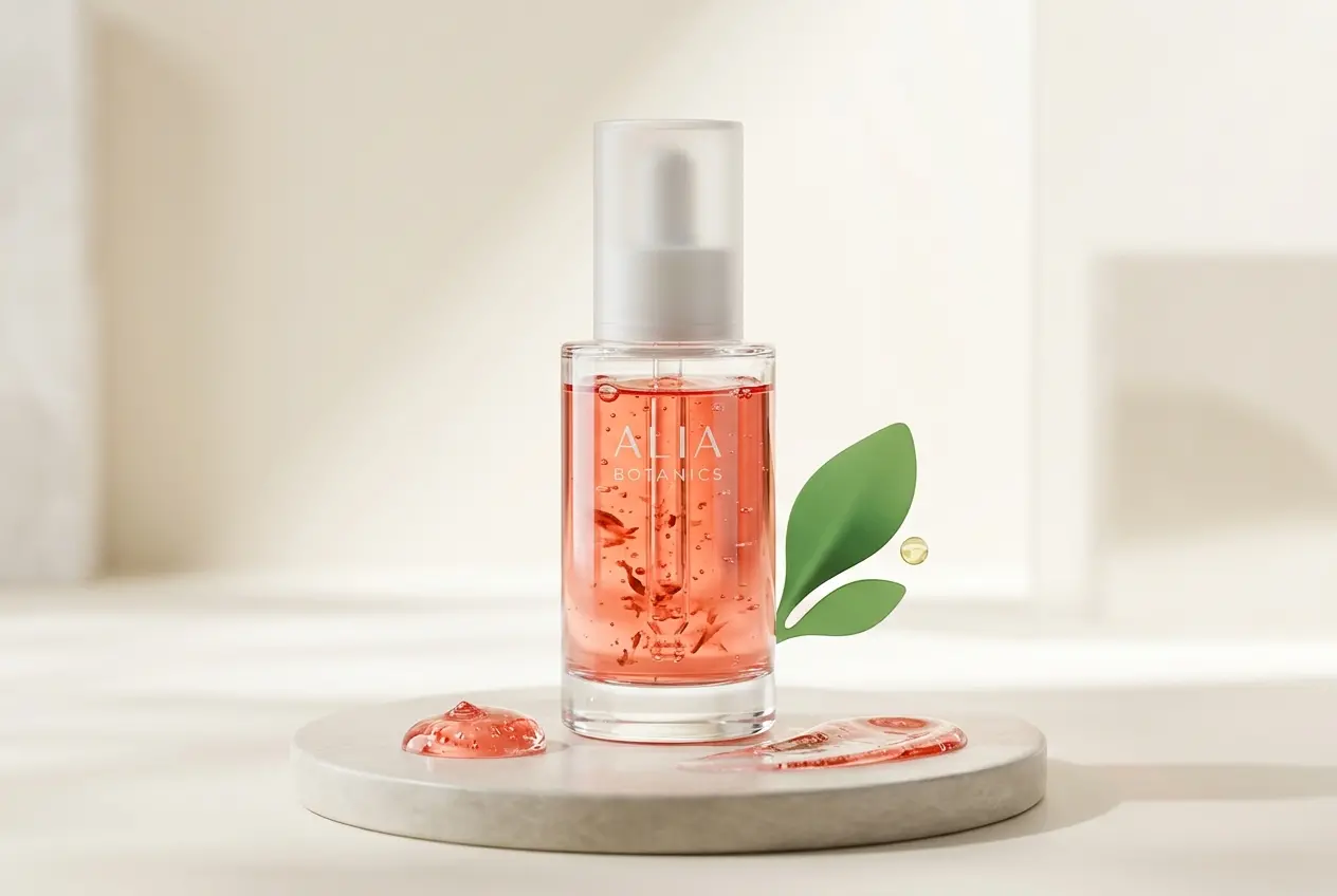
So when we set up materials for a skincare product, we’re thinking about physical accuracy first. A glass bottle with a pump is actually three or four separate material problems: the glass body (which has a refractive index, internal color, surface microstructure), the metallic collar (brushed? polished? which alloy?), the pump head (matte plastic vs. soft-touch coating behave completely differently), and whatever label or sleeve sits on the glass. All four need to be independently authored and they all need to look like they belong in the same physical space.
Refractive Index and Glass Behavior
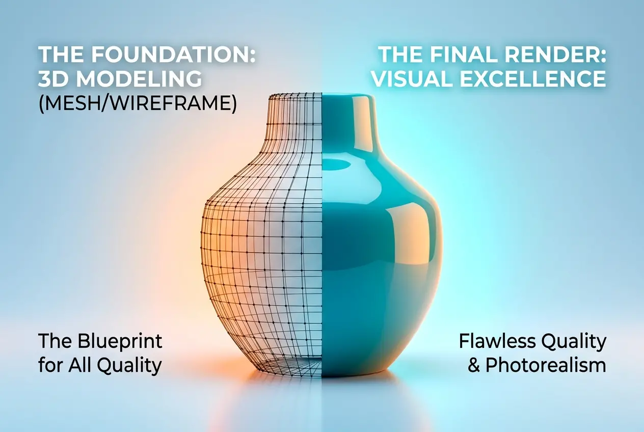
Glass in 3D is not “turn on transparency and add a reflection.” The refractive index — the number that describes how light bends as it passes through the material — needs to be set correctly for the type of glass you’re representing. Clear borosilicate glass, frosted glass, amber glass, tinted glass — these all behave differently. Frosted glass is particularly tricky because it has a surface roughness that scatters transmission, not just reflection. Get that scattering wrong and the bottle looks like foggy plastic instead of properly frosted glass.
We also pay close attention to glass thickness. A thin-walled serum bottle refracts differently than a thick-based perfume vessel. The caustics — the focused light patterns that glass throws onto surrounding surfaces — are a strong visual cue for quality. When they’re present and believable, the image reads as premium. When they’re absent or faked, something feels wrong to the viewer, even if they don’t know what caustics are.
Rendering Liquid Inside Packaging
This is where we see the most oversimplification from non-specialist studios. The liquid inside a bottle is not the same material as the bottle itself. It has its own refractive index, its own color absorption, its own surface behavior at the air-liquid interface inside the container. A face oil should look like it has weight and a slight amber warmth. A hyaluronic serum should look thin and almost water-clear, maybe with a slight blue-cast from light scatter. A thick gel should show some internal cloudiness.
In physically based rendering engines like V-Ray or Arnold, we handle this by building a true nested material — a glass shell containing a liquid volume with volumetric absorption set to the right color and density. This is slower to render than faking it with a tinted glass, but the result is visually honest. The liquid catches light from inside, the bottle casts colored shadows, and the whole thing reads as a real object rather than a surface approximation.
Showing Texture: Creams, Balms, and Pressed Powders
Not every beauty product lives in a bottle. Creams, balms, and pressed powders have a texture problem — you need the viewer to understand the product’s physical character without touching it. This is where displacement and normal mapping become essential tools, not decorative ones.
For a skincare cream shot open in a jar, we use a combination of displacement mapping (which physically moves geometry at render time) and subsurface scattering to simulate how light penetrates the surface of a soft material before bouncing back out. Skin does this, wax does this, thick creams do this. The result is a product that looks genuinely soft and rich rather than like painted foam. The difference between a cream that looks like it was modeled with SSS and one that wasn’t is immediately visible — the SSS version has a depth and warmth to it that makes it look like something you’d want to touch.
Pressed powders and eyeshadows present a different challenge. Their surface is fine-grained and slightly matte, with a characteristic light scatter that’s distinct from smooth plastic or painted metal. We typically build these with a combination of fine displacement (simulating the pressed granular surface) and a high-roughness specular layer, sometimes with a slight anisotropic quality to capture how the pressing tool leaves subtle directional marks across the pan surface.
Communicating Ingredient Claims Through Visual Storytelling
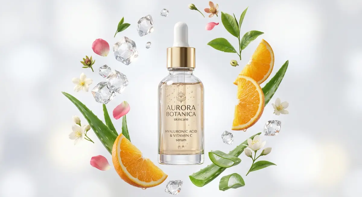
One of the most interesting requests we get from skincare brands is: “Can you show the ingredients?” Not in a text overlay sense — they want imagery that conveys the presence of, say, vitamin C, retinol, hyaluronic acid, or botanical extracts in a way that feels scientific and credible without being literal or cluttered.
There are a few approaches that actually work:
| Ingredient Communication Method | How It’s Rendered | Works Best For |
|---|---|---|
| Liquid splash / droplet integration | Simulated fluid dynamics or sculpted splash geometry with correct surface tension behavior | Serums, oils, hydrating essences |
| Botanical element compositing | High-detail scanned or modeled plant matter, leaves, petals, seeds rendered with the product | Natural and organic skincare lines |
| Molecular / abstract particle elements | Custom geometric clusters (not generic CGI circles) that suggest scientific precision | Clinical / pharmaceutical-adjacent brands |
| Texture close-ups showing formula character | Macro renders showing the product’s physical texture — bubbles, crystalline structures, gel-like clarity | Any formula with a distinctive visual character |
The key discipline here is restraint. Overloaded renders with too many ingredient elements look like stock imagery. What works is one or two purposeful visual cues that reinforce the brand’s ingredient narrative — a single Vitamin C orange sphere in the background, a precisely modeled aloe vera cross-section, a water droplet at 1:1 macro scale showing perfect surface tension. These say “we know what’s in this product” without saying it in text.
Lighting Strategy for Premium Skincare Feel
Lighting is the single biggest differentiator between a beauty render that looks expensive and one that doesn’t. In our studio, we almost never use the default HDRI-only setup for skincare products. We build custom lighting rigs that combine a large soft area light (simulating a photography beauty dish or softbox) with carefully placed secondary sources to create the specular highlights we want on specific parts of the product.
The highlight on a glass bottle’s shoulder, the catch light on a metallic pump head, the soft gradient across the face of a cream jar — these are all placed deliberately, not left to chance. We use render layers and light groups to control each element independently in post, so we can adjust the intensity of a specific reflection without re-rendering the whole scene.
Background and surface also matter more than most clients realize initially. A product floating in white space can look clinical. A product on a slightly textured marble surface, or near a subtly lit piece of raw silk, gives the eye context for the product’s quality positioning. These are still product renders — the product is always the subject — but the environment signals the price point without being distracting.
What Clients Get Wrong When Briefing Beauty Renders
A few patterns come up consistently from first-time clients in the skincare space. Addressing them upfront saves everyone time.
Sending low-resolution label files. The label on a product can be readable at normal scale but completely illegible or blurry when the render is cropped to a close-up detail shot. Always provide label artwork as a vector file or at minimum a 300dpi+ flat image. Ingredient claims and directions text especially — these need to be sharp if the render is going to be used as a product detail page where customers read them.
Assuming “transparent” means the same thing for all products. There’s a big difference between a clear glass bottle, a frosted bottle, an opaque bottle, and a semi-opaque bottle. These require completely different material setups. Know which one your product actually is before briefing — or provide a physical sample, photo reference, or the manufacturer’s technical specification sheet.
Wanting too many hero angles from one lighting setup. A lighting rig that’s perfect for a front-facing hero shot may not work for a three-quarter angle or a flat-lay overhead. If you need multiple distinct angles, the lighting may need to be adjusted between setups. This is normal, not a sign of inefficiency — photography studios do this too, clients just don’t see it.
Treating ingredient story renders as an afterthought. The contextual lifestyle renders with ingredient elements — water splashes, botanicals, close-up texture shots — tend to generate the most engagement on product pages and social media. They shouldn’t be the last thing briefed or the item cut when the budget gets tight. In many cases, they carry more persuasive weight than the pure pack shot.
Formats, Deliverables, and How to Use These Renders
A good 3D beauty render workflow produces more than a JPEG. Depending on the use case, you may need transparent background PNGs for e-commerce, high-resolution TIFFs for print, multiple aspect ratios for social formats, and possibly animated turntable versions for premium product pages. If you’re planning to use the renders across a product range, the 3D scene files themselves are an asset — updating for a new shade, a new volume, or a packaging revision becomes a fraction of the original work.
For brands building a visual system from scratch, we often recommend establishing a canonical hero setup — one lighting rig, one camera position, one set of materials standards — that becomes the template for all SKUs in the range. Consistency across a range is as important as quality in any individual image. When all fifteen products in a line look like they were rendered in the same session, the brand shelf presence is coherent and strong.
If you’re developing a skincare or beauty product and want renders that actually do the work of communicating quality, texture, and formula story — not just showing a bottle — reach out to our team and we can walk through exactly what your product needs and how to get there efficiently.
Frequently Asked Questions
What is 3D product rendering and how does it benefit skincare and beauty brands?
3D product rendering is the process of creating photorealistic digital images of beauty products using specialized software, eliminating the need for physical photoshoots. For skincare brands, this means you can showcase your packaging, textures, and formulas with complete control over lighting, angles, and visual details before a product even goes into production. It reduces photography costs, speeds up marketing timelines, and allows for unlimited creative variations without reshooting.
How can 3D rendering accurately show product textures like creams, serums, and gel formulas?
Advanced 3D rendering software uses subsurface scattering, displacement mapping, and physically based rendering techniques to simulate how light interacts with different skincare textures, from matte clay masks to glossy serums. Artists can replicate the visual weight, consistency, and surface behavior of a formula by referencing real product samples and matching material properties digitally. The result is imagery that communicates tactile quality and product performance to consumers without a single drop of formula being photographed.
Can 3D rendering effectively demonstrate transparency and glass or clear packaging for beauty products?
Yes, transparency and glass packaging are actually areas where 3D rendering excels, since digital artists have precise control over refraction, reflection, and light transmission properties that are notoriously difficult to capture consistently in traditional photography. Renders can showcase the clarity of a serum through a glass dropper bottle, the gradient color of a tinted moisturizer, or the layered fill of a dual-phase product with perfect repeatability. This level of visual consistency is especially valuable for e-commerce listings where packaging transparency is a key purchasing signal.
How can beauty brands use 3D visuals to communicate ingredient claims and formula benefits?
3D rendering allows brands to create exploded ingredient visualizations, cross-section cutaways, and animated sequences that illustrate how active ingredients like hyaluronic acid, retinol, or niacinamide work beneath the skin or within a formula. These visuals transform complex scientific claims into compelling, digestible storytelling that resonates with ingredient-savvy consumers and supports marketing on social media, landing pages, and video ads. Combining photorealistic product renders with motion graphics or infographic overlays creates a powerful tool for educating buyers and building brand credibility.
How much does 3D product rendering cost for skincare brands compared to traditional photography?
The upfront cost of 3D rendering for beauty products typically ranges from a few hundred to several thousand dollars per asset depending on complexity, but the long-term return is significantly higher than traditional photography because the same 3D model can be reused for dozens of variations, campaigns, and formats. Traditional photoshoots require recurring costs for studio rental, photographers, prop styling, and retouching every time packaging or creative direction changes, while a 3D model simply needs minor updates. For brands launching multiple SKUs or planning iterative packaging changes, 3D rendering quickly becomes the more cost-effective and scalable solution.