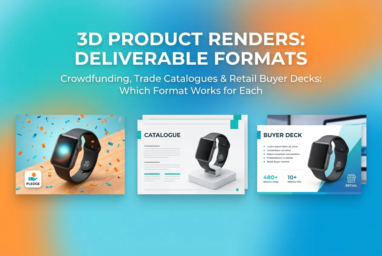
A founder came to us last year with one render — a single hero shot of a smart water bottle — and asked if it would work for his Kickstarter page, his distributor catalogue, and the pitch deck he was taking to a big-box retailer. It wouldn’t, and explaining why turned into a longer conversation than expected. That conversation is basically this blog post. The question of 3D Product Render for Crowdfunding, Trade Catalogues and Retail Buyer Decks: Which Deliverable Format Works for Each comes up constantly in our studio, and the honest answer is that these three audiences read images completely differently, even when the product is identical.
A crowdfunding backer is scrolling on a phone, emotionally deciding in seconds whether to trust a product that doesn’t exist yet. A trade buyer flipping through a catalogue wants clarity, specs, and consistency across fifty SKUs. A retail buyer reviewing a deck before a shelf-space decision wants to see how the product performs in context — on a shelf, in a hand, next to competitors. Same 3D model, three completely different jobs for the render to do. Treating them as one deliverable is where most product teams lose money and credibility.
Why 3D Product Render for Crowdfunding, Trade Catalogues and Retail Buyer Decks: Which Deliverable Format Works for Each Actually Matters
It’s tempting to think of a render as a fixed asset — you make it once, you use it everywhere. But a render is really a communication tool, and communication changes based on who’s listening. A crowdfunding image has to sell a dream. A catalogue image has to sell accuracy. A buyer deck image has to sell shelf performance and margin logic. If you use a moody, cinematic crowdfunding hero shot in a trade catalogue, buyers get suspicious — it looks like you’re hiding the product behind atmosphere instead of showing them what they’re actually stocking. If you use a flat, catalogue-style white background shot on your Kickstarter page, you lose the emotional pull that gets someone to pledge money for something that doesn’t ship for eight months.
We’ve found that founders who understand this distinction early save themselves a full re-shoot cycle later, because they brief the render differently from day one instead of trying to stretch one image set across three unrelated goals.
Crowdfunding: Render for Emotion, Trust, and Story
Crowdfunding backers are taking a leap of faith. There’s no physical product to touch, no return policy that feels solid, and often no brand history to lean on. The render’s job is to compress trust-building into a handful of seconds of scroll time. This means:
- Lifestyle and in-use scenes matter more than pure product shots. A backer needs to see the product doing its job — the bottle sweating with condensation on a hiking trail, the lamp casting warm light across a reading nook. Context sells belief.
- Hero angles with dramatic lighting work better than flat three-point setups. Crowdfunding pages reward a bit of cinema. Rim lighting, shallow depth of field, slightly exaggerated material response — these all read as “premium” to a scrolling audience.
- Exploded views and cutaways build technical credibility. Backers who’ve been burned by vaporware projects specifically look for evidence of engineering. A clean exploded diagram showing the battery, PCB, and housing tells them someone actually thought this through.
- Color and material variant grids reduce pledge hesitation. Show all the colorways in one clean grid so backers can picture their choice without needing five separate renders.
One thing we tell every crowdfunding client: don’t over-polish to the point of looking fake. Backers have gotten good at spotting renders that look too perfect, and it can actually trigger skepticism about whether the product is real. A touch of environmental realism — dust, subtle wear, natural shadow falloff — reads as more trustworthy than a sterile, glossy studio shot.
Trade Catalogues: Render for Clarity, Consistency, and Speed of Comparison

Trade buyers are not being sold a dream. They’re doing due diligence across dozens or hundreds of SKUs, often comparing your product line against three competitors’ catalogues open in other tabs. Here, the render’s job flips entirely — it needs to disappear and let the product information come forward.
| Requirement | Why It Matters for Trade Buyers |
|---|---|
| Neutral or pure white background | Lets buyers focus on form, finish, and proportion without distraction |
| Consistent camera angle across the whole line | Makes visual comparison between SKUs fast and fair |
| Accurate scale cues or dimension overlays | Buyers are calculating shelf space and packaging, not vibes |
| Flat, even lighting | Avoids color misrepresentation — a common cause of return disputes |
| Multiple standard views (front, three-quarter, back, top) | Matches how buyers actually evaluate physical samples |
Consistency is the real skill here, more than any single image’s beauty. A catalogue with fifty products rendered by fifty slightly different lighting setups looks unprofessional, even if each individual image is technically well made. We build a fixed lighting rig and camera template per catalogue project specifically so that SKU 3 and SKU 47 sit on the page looking like they belong to the same disciplined brand.
Material accuracy also carries more weight in catalogues than anywhere else. Buyers are making purchasing commitments based partly on these images, and if the anodized aluminum in the render doesn’t match the anodized aluminum that arrives in the sample box, that’s a relationship problem, not just an aesthetic one.
Retail Buyer Decks: Render for Context, Shelf Logic, and Margin Story
A retail buyer deck is a different animal again. The buyer isn’t asking “is this real” (crowdfunding) or “what exactly does this look like” (catalogue) — they’re asking “will this sell, and where does it fit on my floor.” The render needs to answer commercial questions visually.
What Actually Belongs in a Buyer Deck
- Shelf-context renders. Show the product sitting on a realistic retail shelf, ideally styled to resemble the buyer’s actual store category. A skincare buyer wants to see the bottle among comparable competitor shapes and colors, not floating on white.
- Packaging call-outs. Retail buyers care enormously about carton dimensions, shelf-ready packaging, and how the product reads at a glance from three feet away. Render the packaging with the same seriousness as the product itself.
- Scale comparisons against category norms. If your product is smaller or larger than what’s typically on that shelf, show it — buyers need to picture the planogram.
- Hero shot plus functional detail shots. One strong hero image, followed by two or three renders showing texture, closure mechanism, or a functional detail that differentiates it from what’s already stocked.
Buyer decks also tend to need more restraint than founders expect. A retail buyer flipping through a fifteen-minute deck doesn’t want ten renders of the same product from ten angles. They want four or five decisive images that answer commercial questions, paired with real information — price point, margin, packaging count per case.
Where Founders and Brands Get This Wrong

The most common mistake we see is commissioning one render package and trying to force it into all three contexts. It rarely works cleanly, and buyers and backers both notice when an image feels like it was meant for someone else. The second most common mistake is over-investing in the emotional crowdfunding renders and treating the catalogue and buyer deck versions as an afterthought — which backfires badly once the campaign succeeds and the brand needs to walk into retail conversations with professional, buyer-ready visuals.
Another pattern worth flagging: teams sometimes skip building a proper 3D model early enough, trying to patch together renders from a rough prototype scan. This limits flexibility later — you end up unable to generate the exploded views, the shelf-context scenes, or the packaging renders because the underlying model wasn’t built with enough precision or clean topology to support all three use cases down the line.
The efficient approach is building one high-quality base 3D model, then art-directing three separate render sets from it — lighting, camera, background, and context all tailored to the specific audience. This is exactly the kind of layered 3D product rendering work we structure projects around, because the model only needs to be built once, but it can be lit and staged differently for a Kickstarter hero shot, a catalogue grid, and a retail shelf scene without starting from scratch each time.
Bringing It Together
If there’s one habit that separates brands who navigate crowdfunding, catalogues, and retail decks smoothly from those who struggle, it’s planning the full deliverable set before the first render is even started. Ask what each audience needs to feel or understand, brief the 3D artist with that specific job in mind, and treat the base model as reusable infrastructure rather than a one-off asset. Get this right and you’ll never again be stuck trying to explain to a buyer why your product photo looks like it belongs on a mood board instead of a spec sheet.
If you’re planning a product launch that needs to speak to backers, distributors, and retail buyers without three separate photoshoots, get in touch with our team through our contact page and we’ll help you map out a render package that actually fits each audience.
Frequently Asked Questions
What image resolution and format should I use for Kickstarter or Indiegogo product renders?
Crowdfunding platforms display images at relatively low web resolution, so 1600-2000px wide JPEGs at 72-150 DPI are sufficient and keep page load times fast. Focus on lifestyle context renders and hero shots that convey emotion and function quickly, since backers scroll fast and decide within seconds.
What's the difference between renders needed for trade catalogues versus retail buyer decks?
Trade catalogues require high-resolution 300 DPI CMYK-ready renders with clean orthographic views, dimensions, and multiple SKU variants for print reproduction. Retail buyer decks instead prioritize fewer, polished hero renders in RGB PowerPoint or PDF format, emphasizing shelf-ready packaging shots and category context to help buyers visualize retail placement.
Do I need different camera angles for crowdfunding pages versus print catalogues?
Yes, crowdfunding pages benefit from dynamic 3/4 angles, exploded views, and in-use lifestyle scenes that build emotional connection and explain functionality. Print catalogues need consistent front, side, and back orthographic angles across all products for uniform grid layouts and easy SKU comparison.
Should I request vector or raster files for retail buyer presentations?
Raster renders (high-quality PNG or JPEG) are typically sufficient for retail buyer decks since these are viewed on screens or printed as one-off sales sheets, not mass-produced. However, request layered PSD or vector packaging mockups if buyers need to see private label branding variations quickly.
How many render variations should I budget for across crowdfunding, catalogue, and buyer deck use?
Plan for at least 3-5 core renders (hero, lifestyle, detail, exploded, and packaging shots) that can be repurposed across all three channels with minor cropping or background changes. Budget extra for catalogue-specific orthographic views and buyer-deck-specific shelf or retail context scenes, since these serve different decision-making purposes.