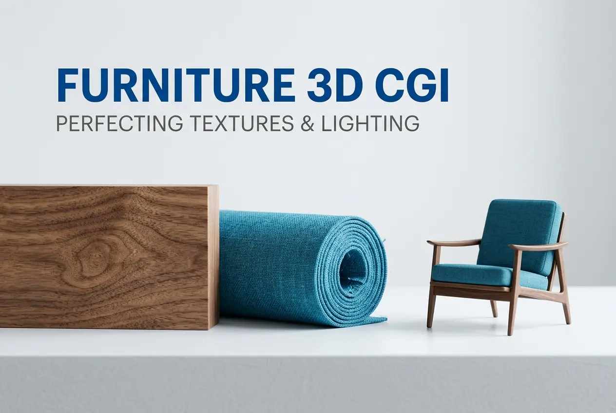
Furniture is one of the hardest product categories to photograph well — and also one of the hardest to render badly when you know what you’re doing. That might sound contradictory, but stay with me. 3D CGI product rendering services for furniture: perfecting fabrics, wood grains, and lighting is genuinely one of the most technically demanding specialisations in our industry, and it’s where the gap between mediocre studios and serious ones becomes very obvious, very fast. A sofa that looks plasticky, a walnut tabletop that reads as painted MDF, a velvet cushion that could pass for rubber — these aren’t just aesthetic failures. They cost brands real sales. At 360render.com, furniture rendering occupies a significant portion of our work, and over time we’ve built up very specific workflows for getting these materials right.
The challenge with furniture specifically is that buyers are intimate with these materials. Everyone has touched wood, sat on fabric, run a hand across a marble tabletop. Their eyes are trained, even if they can’t articulate why something looks wrong. They just know. That instinctive recognition is the bar you’re rendering against. A car render can get away with a little softness because most people aren’t mechanics. Furniture buyers are essentially tactile experts. So when a client comes to us with a new dining chair collection or a bedroom set launch, we know the render either has to convince on a material level or it fails entirely.
This post walks through how professional studios actually approach furniture rendering — the technical decisions behind fabric simulation, wood texture work, and lighting setups — and what separates images that convert from images that just look “nice.”
Why 3D CGI Product Rendering Services for Furniture Demand Material-First Thinking
Most rendering workflows start with geometry and end with shading. For furniture, we flip that priority. Before we model anything in detail, we ask: what’s the hero material? Is it the boucle upholstery? The brushed brass frame? The engineered oak veneer? That answer drives almost every other decision — the lighting angle, the camera distance, the render resolution, even the output format.
Material-first thinking means you’re building the scene around what the material needs to look real, not just what looks good in a generic studio setup. Velvet, for instance, requires light that grazes across the surface to catch its directionality. Flat frontal lighting kills velvet. It needs a light source positioned to reveal the sheen shift — the way velvet appears darker when you brush it one way and lighter the other. If you don’t know that going in, you end up with a cushion that looks like suede at best, foam at worst.
Wood is the opposite problem. It rewards direct, clear lighting that shows off the grain structure and the finish. But “wood” covers an enormous range — raw oak, lacquered walnut, whitewashed pine, ebonised ash. Each has different reflectance, different subsurface behaviour, different grain scale. We maintain a material library at our studio, but for furniture clients we almost always start with reference photography of the actual material sample before we build the shader. A texture map sourced from a stock library and a texture map built from the client’s actual wood species are not the same thing, and that difference shows in the final render.
Getting Fabric Right: Beyond Diffuse Colour
Fabric is where a lot of CGI furniture renders fall apart. The reason is usually that artists treat fabric as a simple diffuse material with a bump map layered on top. That might work for a flat woven canvas. It doesn’t work for chenille, boucle, velvet, linen, or any fabric with a complex weave structure.
Modern fabric shading in professional pipelines involves several layers working together:
- Diffuse colour maps — the base colour variation across the weave
- Normal or displacement maps — the physical micro-geometry of the weave pattern
- Anisotropic sheen parameters — the directional light response that gives fabrics their characteristic glow
- Fuzz/fibre scattering — the way fabric fibres catch backlight and create that soft halo effect
In production, we often use physically-based fabric shaders available in renderers like V-Ray, Corona, or Arnold — each of which handles fabric differently. We’ve found that Corona’s fabric shader gives us the cleanest results for mid-pile materials like velvet and chenille, while V-Ray’s layered material system gives us more control over complex weave-on-weave patterns like jacquard upholstery.
The geometry underneath matters too. A well-built cushion mesh with proper soft-body physics simulation or hand-sculpted compression wrinkles will look natural. A perfectly smooth, algorithmically-generated cushion form will read as fake even with a perfect shader on top. Real cushions sag slightly, indent at seams, and compress at contact points. Modelling that reality — even subtly — closes the gap between “CGI” and “photograph.”
Wood Grain: Texture Maps Are Only Half the Story

We get briefs regularly from furniture brands where the reference image is a particular wood species — American walnut, white oak, teak, wenge. The expectation is that we match the actual wood used in production, not a generic stand-in. That’s a reasonable expectation and completely achievable, but it requires the right process.
High-resolution wood textures need to be photographed or scanned from real samples, not downloaded from texture libraries. Stock wood textures are often oversaturated, have obvious tiling issues at scale, and represent a generic interpretation of a species rather than the specific cut and finish a manufacturer uses. Radial cut oak looks completely different from quarter-sawn oak. The finish layer — whether it’s an oiled raw finish, a matte lacquer, or a high-gloss polyurethane — changes the material’s reflectance profile significantly.
Beyond the texture map, the shader setup for wood involves:
| Property | What it Controls | Common Mistake |
|---|---|---|
| Specular Roughness | How sharp or blurred the reflections are | Setting it too low, making wood look lacquered when it’s oiled |
| IOR (Index of Refraction) | The intensity of specular highlights | Using default values that don’t match the finish type |
| Reflection Map | Variation in reflectance across the grain | Using a flat constant value across the whole surface |
| Bump/Normal Depth | How pronounced the grain texture feels under raking light | Over-exaggerating to compensate for weak lighting |
| Colour Temperature of Wood | Warm/cool undertone of the species | Matching photographs taken under wrong ambient light |
One thing that elevates wood rendering specifically is variation. Real wood has irregularities — knots, grain shifts, colour variation across a tabletop. When a texture tiles uniformly or runs too straight, it reads as artificial immediately. We use procedural variation layers and sometimes hand-paint texture breaks to give wood surfaces the subtle imperfection that makes them feel real.
Lighting for Furniture: Studio vs. Lifestyle Context
Lighting decisions split into two distinct approaches depending on what the client needs: studio product shots or lifestyle/room-context renders. Both are valid, but they require completely different setups and serve different purposes.
Studio product lighting is about clarity and neutrality. The goal is to show the product accurately — its form, colour, texture, and proportion — without distraction. We typically use a three-point system with a large soft key light, a fill light to control shadow depth, and a rim light to separate the product from the background. For furniture, the background is usually a clean seamless white or a soft gradient. This type of render works well for e-commerce listings, catalogues, and specification sheets.
Lifestyle lighting is about context and emotion. You’re placing the furniture in a room or environment and lighting the whole scene. This is where HDRI environment maps, natural window light simulation, and layered artificial lighting come together. The furniture shares the scene with architecture, flooring, accessories — and all of it needs to read consistently under the same light. This is significantly more complex to set up and render, but the output looks like a magazine photograph and is powerful for brand marketing, social content, and campaign imagery.
We’ve found that the most common mistake clients make is assuming lifestyle renders are always better. For an e-commerce listing where someone needs to compare two sofa options side by side, clean studio renders with consistent lighting are more effective because they allow direct comparison. Context renders become essential when you’re selling a brand feeling, not just a product specification.
What Clients Often Get Wrong When Briefing Furniture Renders

The brief quality we receive varies enormously, and it directly affects output quality. A few recurring issues:
Providing low-resolution reference material. A mobile phone photo of a fabric swatch doesn’t give us enough to build an accurate shader. Whenever possible, clients should supply high-resolution scans or professional photographs of actual material samples. Some clients send us physical samples by post, which we photograph in-house. That’s not always practical, but it consistently produces the best texture references.
Inconsistent finish specifications. “Matte black legs” and “gloss black legs” look nothing alike in a render. If the product specification doesn’t clearly describe the surface finish, we’ll either have to guess or go back for clarification — both of which slow the project down. A finish reference photo alongside the material spec makes a significant difference.
Unrealistic angle requests. Clients sometimes request camera angles that no real photographer would use — extremely low angles that hide the seat cushion, or top-down perspectives that obscure the leg design. We’ll always execute the brief as given, but we also provide our recommended camera angles based on what shows the product most effectively. Taking that input into account usually results in stronger final images.
Expecting colour accuracy without a calibrated workflow. Colour calibration across monitors, proofing devices, and print outputs is a real technical consideration. If a client is using an uncalibrated monitor and their wood colour looks too warm, the problem may not be in the render. We always deliver renders with embedded colour profiles and recommend clients view them in a calibrated environment before requesting revisions.
The Practical Payoff: Why This Level of Detail Matters
All of this technical work exists because furniture is a considered purchase. Buyers spend time looking at images before they buy. They zoom in. They compare. They try to imagine the piece in their own space. Every detail in the render either builds or erodes their confidence in the product.
Brands that invest in accurate, material-faithful renders — images where the velvet looks touchable and the oak looks real — build trust faster than brands showing poorly-lit photography or generic CGI. For product launches, collection catalogues, or e-commerce platforms, the render quality is directly visible in the buying experience.
Our work as a studio is to make sure that when someone looks at a furniture render, they don’t think “that’s a nice render.” They think “I want that sofa.” The technical specificity is what gets us there.
If you’re working on a furniture collection and want to discuss how professional product rendering services can work for your specific materials and brief, we’d be glad to talk through what’s involved. Reach out to our team at 360render.com and let’s look at what your project needs.
Frequently Asked Questions
How does 3D CGI rendering accurately replicate fabric textures like velvet or linen for furniture products?
3D CGI artists use high-resolution texture mapping and physically based rendering (PBR) techniques to simulate how light interacts with individual fabric fibers, capturing the subtle sheen of velvet or the coarse weave of linen with photorealistic accuracy. Advanced software like V-Ray or Corona Renderer allows artists to layer diffuse, specular, and normal maps to replicate the tactile qualities of upholstery materials. This means furniture brands can showcase multiple fabric options in their product catalogs without ever physically producing each variation.
What makes wood grain textures look realistic in CGI furniture rendering?
Achieving realistic wood grain in CGI requires a combination of high-resolution scanned wood textures, displacement mapping, and careful calibration of surface reflectivity to mimic how natural light bounces off polished or matte finishes. Skilled 3D artists also account for wood's anisotropic properties, meaning reflections vary depending on the grain direction, which is critical for materials like oak, walnut, or mahogany. This level of detail ensures the rendered furniture looks indistinguishable from a professional product photograph.
How long does it typically take to complete a 3D CGI product rendering for a furniture piece?
The turnaround time for a single furniture rendering generally ranges from 2 to 5 business days, depending on the complexity of the design, the number of materials involved, and the level of detail required. Rush projects with simple geometries and straightforward textures can sometimes be completed within 24 to 48 hours, while fully staged lifestyle scenes with multiple furniture pieces may take up to 2 weeks. Providing detailed reference materials, CAD files, and clear briefs upfront significantly reduces revision cycles and speeds up delivery.
Can 3D CGI rendering replace traditional product photography for furniture brands?
Yes, 3D CGI rendering is increasingly replacing traditional photography for furniture brands because it eliminates costs associated with physical prototypes, studio rentals, and professional photography crews while offering greater creative flexibility. Brands can easily swap colors, materials, and environments within the same 3D model, making it ideal for e-commerce catalogs where multiple variants need to be displayed. Studies show that high-quality CGI renders can achieve conversion rates comparable to or even exceeding those of traditional photography when executed at a photorealistic level.
What lighting techniques do CGI artists use to make furniture renders look photorealistic?
CGI artists rely on HDRI (High Dynamic Range Imaging) lighting environments to simulate natural and studio light conditions, ensuring shadows, reflections, and ambient occlusion behave exactly as they would in real life. They also use three-point lighting setups, area lights, and physically accurate light falloff to highlight a furniture piece's key design features such as carved wood details or tufted upholstery. Proper lighting not only enhances realism but also guides the viewer's eye toward the product's most marketable attributes, directly supporting better consumer engagement.
Also read: 3D Lifestyle Images for Furniture Brands: How to Art-Direct a Scene Without a Photo Shoot