If you’ve ever received a stunning 3D product render, loved it on screen, then watched it print flat, dull, or slightly off-colour — you’re not alone. This is one of the most common frustrations we hear from clients, and it’s exactly why understanding why 3D product renders look different on screen vs print: colour profiles, resolution and export settings explained matters more than most people realise. The gap between what you see on a monitor and what comes out of a printer isn’t a rendering mistake. It’s a technical reality rooted in how screens generate colour versus how printers deposit ink — and if you’re not accounting for that difference at every stage of the workflow, you’ll keep getting surprises.
In our studio, we work with product manufacturers, e-commerce brands, and packaging designers who need renders that perform across both digital and print contexts. Sometimes that means a single image needs to look sharp on a website product page and on a printed retail box. Those are two completely different requirements, and treating them as the same job is where things go wrong.
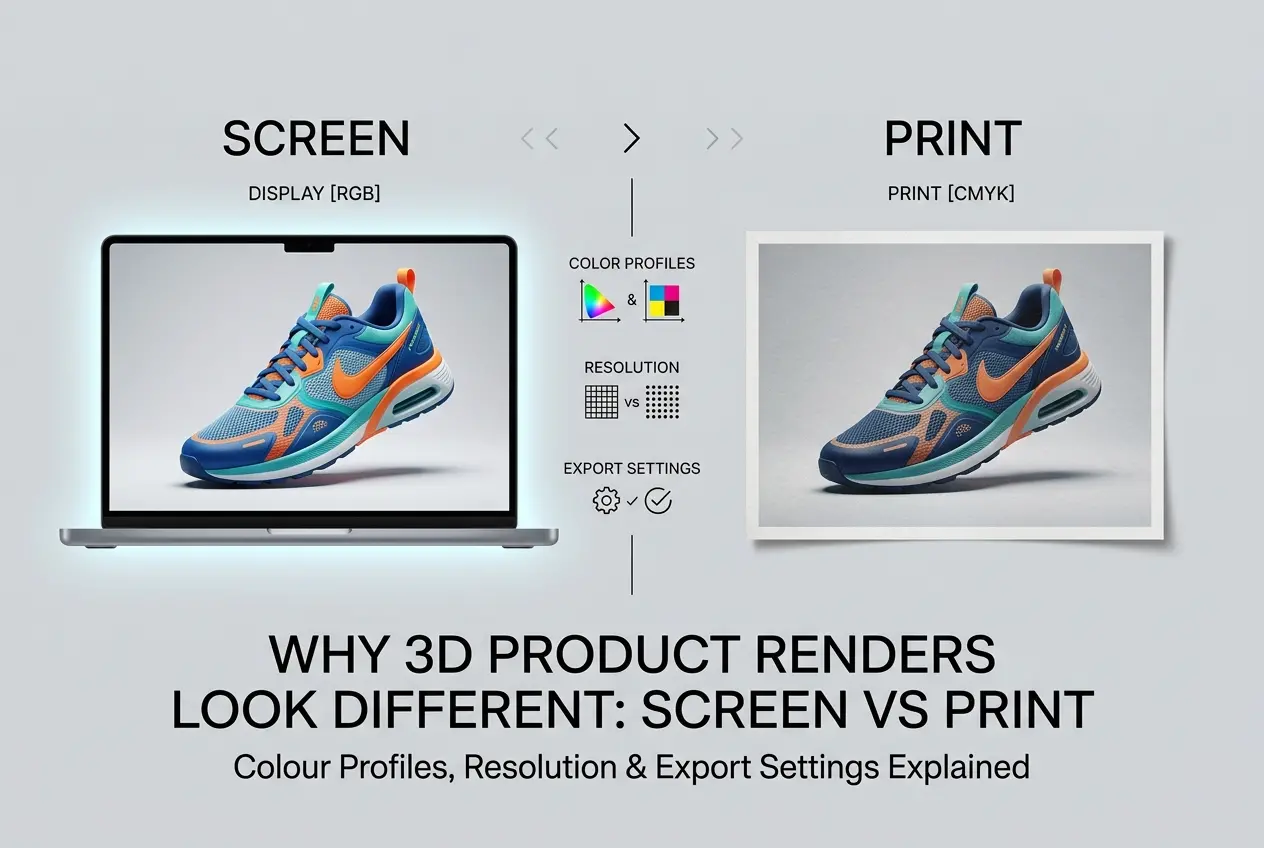
Let’s break this down properly — colour science, resolution, and export settings — so you can brief your 3D artist correctly and stop being caught off guard when the prints arrive.
The Root Cause: RGB Screens vs CMYK Printers
Every screen — your monitor, your phone, your client’s laptop — generates colour using light. Red, green, and blue light combine to create the full visible spectrum. This is the RGB colour model, and it’s additive: more light means brighter, more saturated colour. A render coming out of software like V-Ray, Corona, or Blender lives naturally in RGB. It’s born in that colour space.
Printers work the opposite way. They lay down cyan, magenta, yellow, and black (CMYK) inks onto a physical surface. Ink absorbs light rather than emitting it, so the colour model is subtractive. More ink means darker, not brighter. The colour gamut — the total range of colours a printer can physically reproduce — is smaller than what an RGB screen can display. This is the fundamental mismatch, and it explains a huge portion of why 3D product renders look different on screen vs print.
Here’s the practical consequence: certain electric blues, neon greens, and saturated reds that look perfect on screen simply cannot be reproduced by a commercial offset or digital press. When those out-of-gamut colours are converted to CMYK without care, they get clipped or shifted to the nearest printable equivalent. The result looks flat, muddy, or just wrong compared to the original render.
Colour Profiles: sRGB, Adobe RGB, and CMYK Explained
A colour profile (or ICC profile) is essentially a set of instructions that tells a display or printer how to interpret colour values in a file. Without a correctly embedded profile, software has to guess — and it often guesses wrong.
Most 3D rendering software outputs images in sRGB by default. sRGB is the standard colour space for the web and consumer displays. It’s a relatively conservative gamut, widely supported, and predictable. For e-commerce product renders destined for Amazon, Shopify, or social media, sRGB is absolutely the right choice.
Adobe RGB has a wider gamut — it can hold more colour information, particularly in the greens and cyans. Some professional photographers and print studios prefer to work in Adobe RGB because it preserves more data before the final CMYK conversion. If your renders will go through a sophisticated pre-press workflow, requesting Adobe RGB output makes sense. But if an Adobe RGB file gets displayed without the profile being recognised, it looks desaturated and flat — which is the opposite of what you want.
For print, the conversion eventually needs to land in a CMYK profile. The most common ones are Fogra39 (used across most of Europe for coated paper) and SWOP (used in North America). The right profile depends entirely on the printer and the substrate. Packaging printed on uncoated stock uses a different profile than a high-gloss product brochure. This is why we always ask clients to confirm their print specification before we finalise a render intended for physical output.
| Colour Space | Best Used For | Watch Out For |
|---|---|---|
| sRGB | Web, e-commerce, social media, screen presentations | Smaller gamut than Adobe RGB; avoid for high-end print workflows |
| Adobe RGB | Pre-press, professional print, editorial photography | Looks desaturated on uncalibrated screens if profile isn’t embedded |
| CMYK (Fogra39/SWOP) | Commercial offset printing, packaging, catalogues | Cannot be used for digital display; gamut is smaller than RGB |
Resolution: What the Numbers Actually Mean

Resolution is probably the most misunderstood part of this conversation. Clients often ask for “high resolution” without specifying what that means — and the answer genuinely depends on the end use.
For screens, resolution is measured in pixels. A render at 1920×1080 pixels is perfectly fine for Full HD displays. For a website hero image or a social media post, that’s often more than enough. The pixel count is what matters for digital output, not the PPI (pixels per inch) setting baked into the file — because screens don’t care about physical print size.
For print, it’s completely different. Now physical size and PPI both matter. Commercial printing generally requires 300 PPI at the final print size. So if you need a render printed at 20cm × 20cm at 300 PPI, you’re looking at roughly 2362 × 2362 pixels minimum. A large format print — say a 1-metre wide retail display — might only need 100–150 PPI because viewing distance is greater, so the pixel math changes.
We’ve found that one of the most common mistakes clients make is taking a render originally produced for digital use and trying to repurpose it for a large-format print. A 72 PPI web image scaled up to poster size will look soft, pixelated, or just blurry. The solution isn’t to upscale in Photoshop — the solution is to render at the correct resolution from the start. Re-rendering costs time and render credits; planning ahead costs nothing.
Export Settings: File Format, Bit Depth, and Compression
How you export a render can degrade everything you’ve worked to achieve. Even a beautifully lit, correctly colour-managed render can be ruined by the wrong file format or a careless compression setting.
JPEG is lossy — every time you save a JPEG, some image data is discarded. For final web delivery, a high-quality JPEG (quality 85–95%) is acceptable and keeps file sizes manageable. But for a print workflow, you should never be handing over a JPEG as the master file. Use it only as a final delivery format, never as an intermediate working file.
TIFF is the standard for print. It supports lossless compression, can hold 16-bit or even 32-bit per channel colour data, and preserves embedded ICC profiles reliably. If you’re sending files to a repro house or a packaging printer, TIFF is almost always what they want.
PNG is lossless and supports transparency, making it excellent for e-commerce product shots on white backgrounds or composite work. It’s fine for screen use but less common in professional print workflows.
EXR (OpenEXR) is a 32-bit HDR format used internally in rendering pipelines. It holds the full linear light data from a render before any colour grading or tone mapping is applied. We keep EXRs as archival master files so we can re-grade and re-export a render years later for new uses without going back to square one.
Bit depth matters too. An 8-bit image holds 256 values per channel. A 16-bit image holds 65,536 values per channel. For smooth gradients — think a product shot with a soft studio background gradient — 16-bit prevents the banding you sometimes see in cheaper exports. Always work at 16-bit internally and only reduce to 8-bit for final web delivery.
Why 3D Product Renders Look Different on Screen vs Print: The Workflow Fix

The real answer to why 3D product renders look different on screen vs print is almost always workflow-related rather than a rendering quality issue. Here’s what a correct dual-purpose workflow looks like in practice:
- Render in linear light at high resolution — always render larger than you think you need. It’s easy to downscale; upscaling costs quality.
- Save the master as an EXR or 16-bit TIFF — this is your insurance policy for any future use.
- Colour grade with the output in mind — if you know the final output is print, do a soft proof in Photoshop using the correct CMYK profile to check what will survive the conversion before you finalise the grade.
- Embed the correct ICC profile in every file you send. Don’t assume the recipient’s software will guess correctly.
- Communicate with your printer — ask for their spec sheet. Different presses and substrates behave differently, and a good repro house will tell you exactly what they need.
- Calibrate your monitor — this one is on the artist’s side. If we’re grading on an uncalibrated screen, everything we produce is guesswork. A hardware calibrator used regularly is non-negotiable in a professional studio.
One thing we tell every client who needs renders for both digital and print: brief us for both at the start of the project. Retrofitting a web render for print almost always means extra work and sometimes a full re-render. When we know upfront, we structure the entire pipeline to accommodate both outputs efficiently.
What Clients Get Wrong Most Often
A few patterns come up repeatedly. First, clients assume the render file they received for their website is automatically suitable for their product packaging. It rarely is — different resolution requirements, different colour profiles, different file formats.
Second, some clients view a render on multiple devices — phone, laptop, external monitor — and see different colours on each, then conclude the render is wrong. The render is usually fine. The uncalibrated screens are the variable. This is why professional studios and pre-press facilities use hardware-calibrated, colour-accurate displays.
Third, there’s a tendency to over-compress images to meet file size limits on e-commerce platforms without understanding that aggressive JPEG compression introduces artefacts around product edges and in smooth gradients — exactly the areas that matter most for product photography. Better to resize to correct dimensions first, then compress minimally.
For brands using professional 3D product rendering services, getting these technical specs sorted before production begins is the most cost-effective approach. Changes at the render stage are always cheaper than changes after delivery.
Conclusion
Colour profiles, resolution, and export settings aren’t afterthoughts — they’re foundational decisions that shape how a render performs in the real world. Understanding why 3D product renders look different on screen vs print puts you in a much stronger position to brief your 3D studio correctly, ask the right questions, and avoid the expensive cycle of revisions that comes from misaligned expectations.
If you’re planning a product render project and need it to work across both digital and print, we’re happy to walk through the specifications with you before a single frame is rendered. Get in touch with our team at 360render.com and we’ll make sure your output is built right from the start.
Frequently Asked Questions
Why do my 3D product renders look washed out when printed compared to how they appear on screen?
This happens because screens display colour using the RGB colour model, which produces vibrant colours through emitted light, while printers use the CMYK colour model, which works with ink absorption and has a smaller colour gamut. Colours that appear vivid on screen, particularly bright blues, greens, and oranges, often cannot be accurately reproduced in print, resulting in a duller, washed-out appearance. To fix this, convert your render to a CMYK colour profile such as ISO Coated v2 before exporting, and soft-proof the image in Photoshop to preview how it will actually look when printed.
What resolution should I export my 3D product renders at for print versus digital use?
For print, 3D product renders should be exported at a minimum of 300 DPI (dots per inch) at the final intended print size, as anything lower will appear pixelated or soft in physical reproduction. For digital use such as websites, social media, or presentations, 72 to 96 DPI is standard since screens measure display in pixels rather than physical dots, and higher DPI does not improve on-screen quality. Always render at the highest resolution possible and downscale for digital use rather than upscaling a low-resolution render, which permanently degrades image quality.
Which colour profile should I use when setting up my 3D render for a product catalogue going to print?
For professionally printed product catalogues, you should use the ISO Coated v2 (ECI) or FOGRA39 colour profile, which are the industry-standard CMYK profiles used by most commercial print houses in Europe, while US-based printers commonly use SWOP or GRACoL profiles. Setting the correct profile in your 3D software or at the export stage in Photoshop ensures that the colours your render displays are within the printable gamut of commercial offset printing. Always check with your specific print supplier which profile they require, as using the wrong one can cause significant colour shifts between your file and the final printed piece.
Why does my 3D render look different across various computer monitors before it even goes to print?
Monitors display colour differently because they have varying colour gamuts, brightness levels, and factory calibration settings, meaning a render viewed on an uncalibrated consumer laptop will look different from the same file on a colour-accurate professional monitor. This inconsistency is managed through colour management systems (CMS) and monitor calibration using hardware tools like a colorimeter, which creates an ICC profile that standardises how your display interprets colour data. For consistent results across devices and into print, always work in a standardised colour space such as sRGB for digital outputs or Adobe RGB for print workflows, and ensure your monitor is hardware-calibrated regularly.
What file format should I export 3D product renders in to preserve quality for both screen and print use?
For print, export your 3D renders as TIFF or high-quality PDF files, as these formats support CMYK colour profiles, retain full image data without compression artefacts, and are universally accepted by professional print suppliers. For screen and digital use, high-quality JPEG or PNG formats work well, with PNG being preferable when you need a transparent background or are working with graphics that require sharp edges. Avoid saving print-intended renders as standard JPEG files repeatedly, as JPEG uses lossy compression that progressively degrades image quality with each save, which can introduce visible artefacts in large-format printed materials.